Work > Cover
Split the check in seconds
Cover was an iPhone and Android app for making dining out easier. At a restaurant that accepts Cover, diners can split the check, calculate the tip, and pay with Apple Pay or a credit card. Since there's no check at the end of the meal, they can leave without waiting for the server.
Along with the diner-facing mobile app, Cover's restaurant-facing iPad app helped save servers' time by cutting down on card swipes. In a way, the product reminded me of what I enjoyed most during my time working with sellers at Etsy. We created positive products for people on both sides of a transaction.
I joined Cover as their second designer in February, 2015. By April, we set out to rebrand the company and redesign its iPhone app and website, giving us the foundation to grow in a competitve mobile payments space.
From the Beginning
Checking into a restaurant in Cover 1.0
When I arrived in February, Cover's iPhone app was a polished proof of concept. It focused on one function – splitting the check and automating the tip after entering a restaurant. In later updates, this became even easier by allowing people to sign up with Facebook and split the check with friends who don't have Cover.
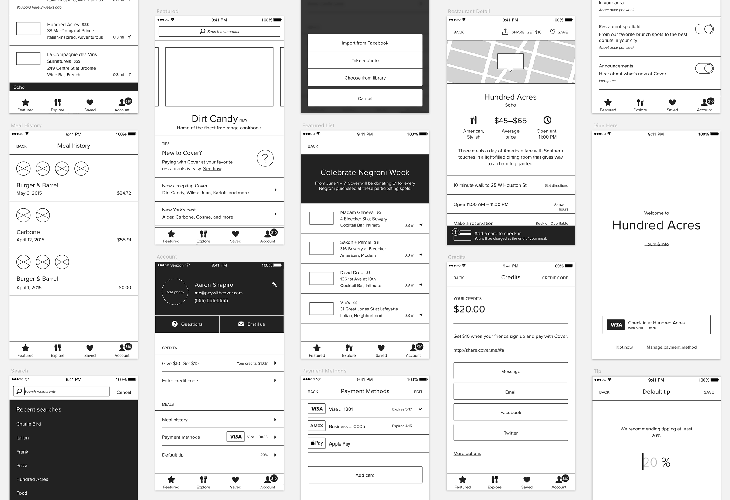
But as we turned our attention to restaurant discovery features, Cover's handful of screens started to become cluttered. Without a navigation structure to compartmentalize different types of tasks, we were adding functionality to places the app wasn't designed for – making what was a refreshingly simple payment flow more complicated.
The Cover brand was also in need of an refresh. Not only were we running out of space to add new information about restaurants in the app, but that information was difficult to read due to the brand's dark color scheme and display typeface. And as we would later discover, most apps in the food and dining space used knives and forks in their logos and app icons.
Adding complexity over time to Cover 1.0
It's hard to justify starting from scratch. Valuable months that would otherwise be spent exploring new product ideas would instead be spent restructuring existing features. After a few struggles, it quickly became clear that having a scalable foundation for future product development would be necessary.
The team
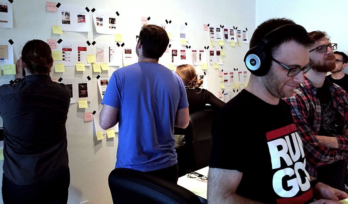
I met our Frank and Kim, Cover's product and design leads, while working at Etsy. During our time there, we helped transform their engineering focused process into a more inclusive one that brought contributors together from across the company early and often in a product's development. Involving everyone – even from outside of the product team – meant goals were quickly defined, mistakes were caught earlier, and solutions were more creatively executed.
Cover's team was dwarfed by Etsy's, but we scaled the same process down for our redesign. The engineers helped define the project's scope while sharing quantitative data from Cover 1.0. Cover's operations team – a group of former industry experts turned points of contact – also shared qualitative feedback from our restaurant partners.
Aside from sitting near each other to facilite constant communication, our forum for cross-team brainstorming and feedback took place in brief, twice-weekly office hours. In some sessions we encouraged participation with Post-It exercises on industry research. Others were prototype presentations that led to complex engineering discussions. Documenting ideas and progress in Basecamp was another holdover from Etsy, giving us a second, more permanent avenue for feedback.
Kicking off Cover 2.0
At the beginning of each project, our product team meets to define its goals. We do this by looking at the existing product, documenting its strengths and weaknesses, and coming to an agreement on what we're trying to accomplish. For Cover 2.0, we defined four key goals:
Build a foundation for the future
Cover 1.0 was limited by its single focus. We wanted to introduce a scalable navigation model that would allow us to add new features and improve old ones without making screens overly complex.
Provide reasons to open Cover before a meal
More restaurants accept Cover than any of our competitors, and our team was regularly marketing new restaurants in emails and on social media. We wanted to bring this curated content into the app alongside better discovery tools.
Address problems with check splitting
Splitting the check with Cover was already easy, but we knew there was room for improvement when sending and receiving invites. Helping people put their phones away more quickly would let them focus on what's important – enjoying their company.
Clear up confusion at the end of the meal
One of Cover's long-term goals is to remove the need to open an app by completely automating the payment process. We had already done this at the end of the meal, but breaking habits is difficult – people were afraid to leave the restaurant without confirmation from their server. We wanted to find a comfortable mix of instruction and simplicity throughout the experience.
We intentionally left these goals vague. This process was designed to give everyone on the team an opportunity to define the project while still giving us the flexibility to explore different approaches as we iterate down the road.
Discovery
Cover is one of dozens of small companies working to gain a foothold in two crowded spaces. Mobile payments has matured with technologies from companies like Apple Pay and Square. The restaurant industry, on the other hand, is being flooded with apps for discovery, reservations, ticketing, waitlists, point-of-sale systems, customer loyalty, and payments.
Each of Cover's competitors is taking a different approach but the goal is the same – an end-to-end system that lets diners rely on a single app for an experience that begins and ends outside of the restaurant. The unsettled industry makes standing out important, and dedicating time to understanding our competition was a valuable step of our design process.
Kim and I spent a few days analyzing a number of apps, using printouts and Post-Its to gather our high-level takeaways. Since we would be refreshing our brand, we started by looking at app icons, color schemes, typography, and image treatments in apps serving the restaurant industry.
Reviewing discovery takeaways with the product team
Payments are sensitive, especially when making them through a new, unfamilar process. We also looked at how payment apps – especially those whose brand hadn't already built ubiquitous trust – reinforced security. Common motifs surfaced that implied a transaction is taking place, from colors and credit card logos to the way numbers were being presented on a receipt.
We finished by looking at apps that helped people find restaurants, venues, and events. From talking to diners we already knew price and location were the most important factors when deciding on where to eat, so we catalogued how other apps were using this information across contexts like maps, lists, and detail screens. And since Cover is only available in New York, the Bay Area, and Los Angeles, we looked outside of Apple Maps to see how alternatives like Citymaps and Google Maps handled information density in busy urban areas.
Early Iteration
I start every project – even those with quick timelines – with black-and-white wireframes. Sometimes it's difficult to work at a low fidelity, but setting these limitations speeds up iteration in a phase where it's important to quickly cycle through ideas.
Wireframing in Sketch
Curated content
As our operations team grew and Cover gained more traction in our three cities, we were adding several new restaurants every week. We'd already been sending out twice-weekly emails to promote both new and existing restaurants, but this unique content was disappearing in peoples' inboxes.
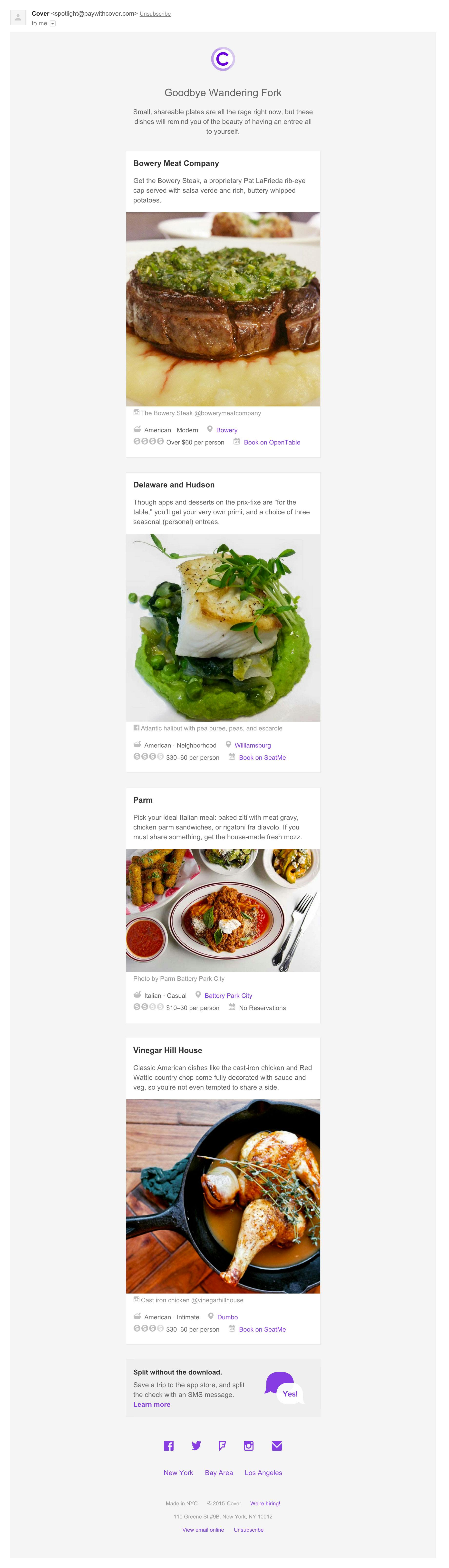
One of Cover's curated marketing emails
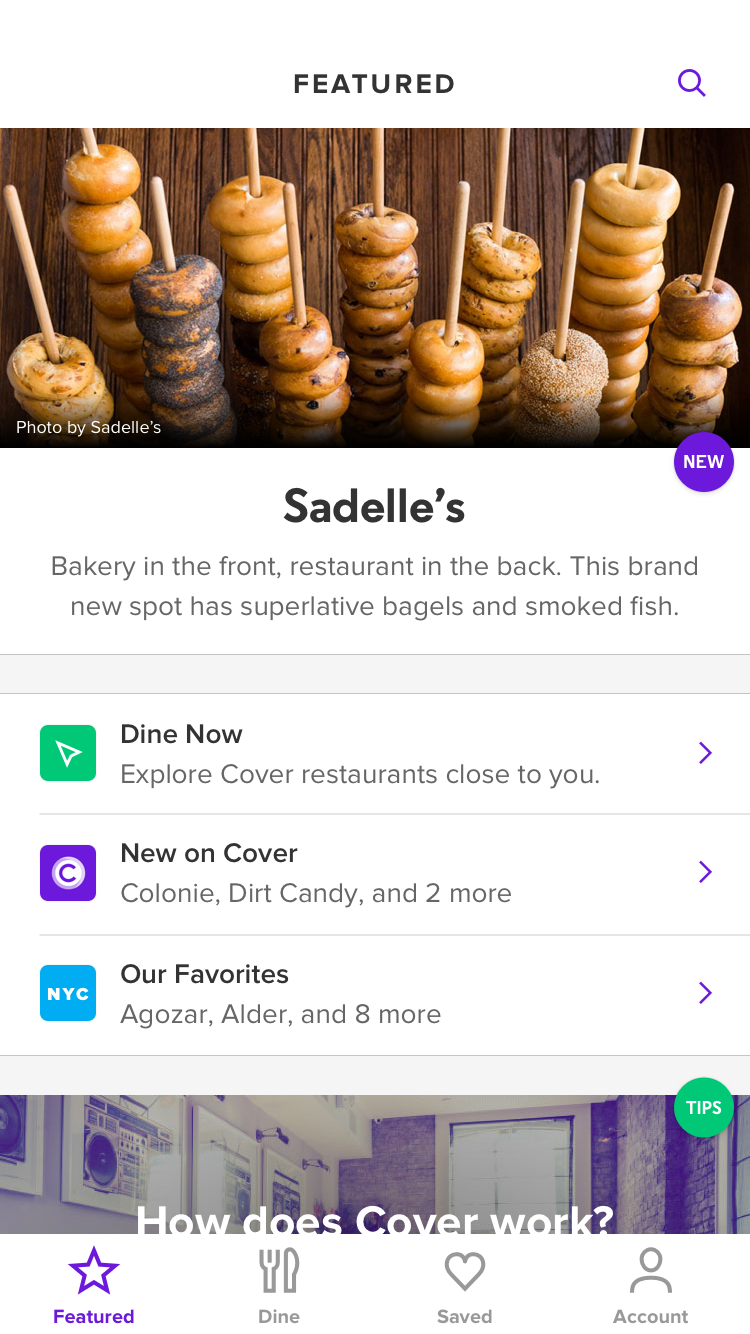
Featured restaurants in Cover 2.0
To make the most of this content, we designed a landing screen that would incorporate announcements and recommendations from our emails.
By updating the app regularly with new restaurants and best-of lists, we gave people a reason to open Cover outside of restaurants. We even reserved space for help and promotional content since this would be the first screen people already logged in would see.
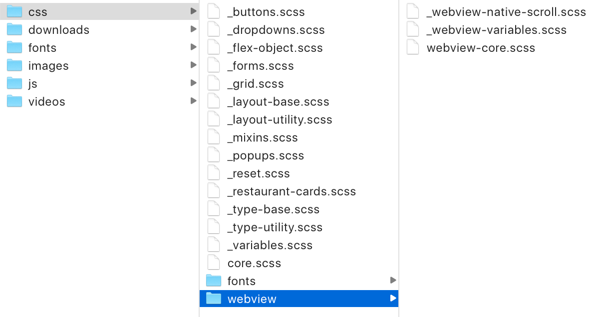
We generated this webview from a simple YAML file so anyone on the team could push separate updates to New York, the Bay Area, and Los Angeles in minutes. To ensure the screen would feel like the rest of the app, I designed a simple CSS framework that would let us mirror native components.
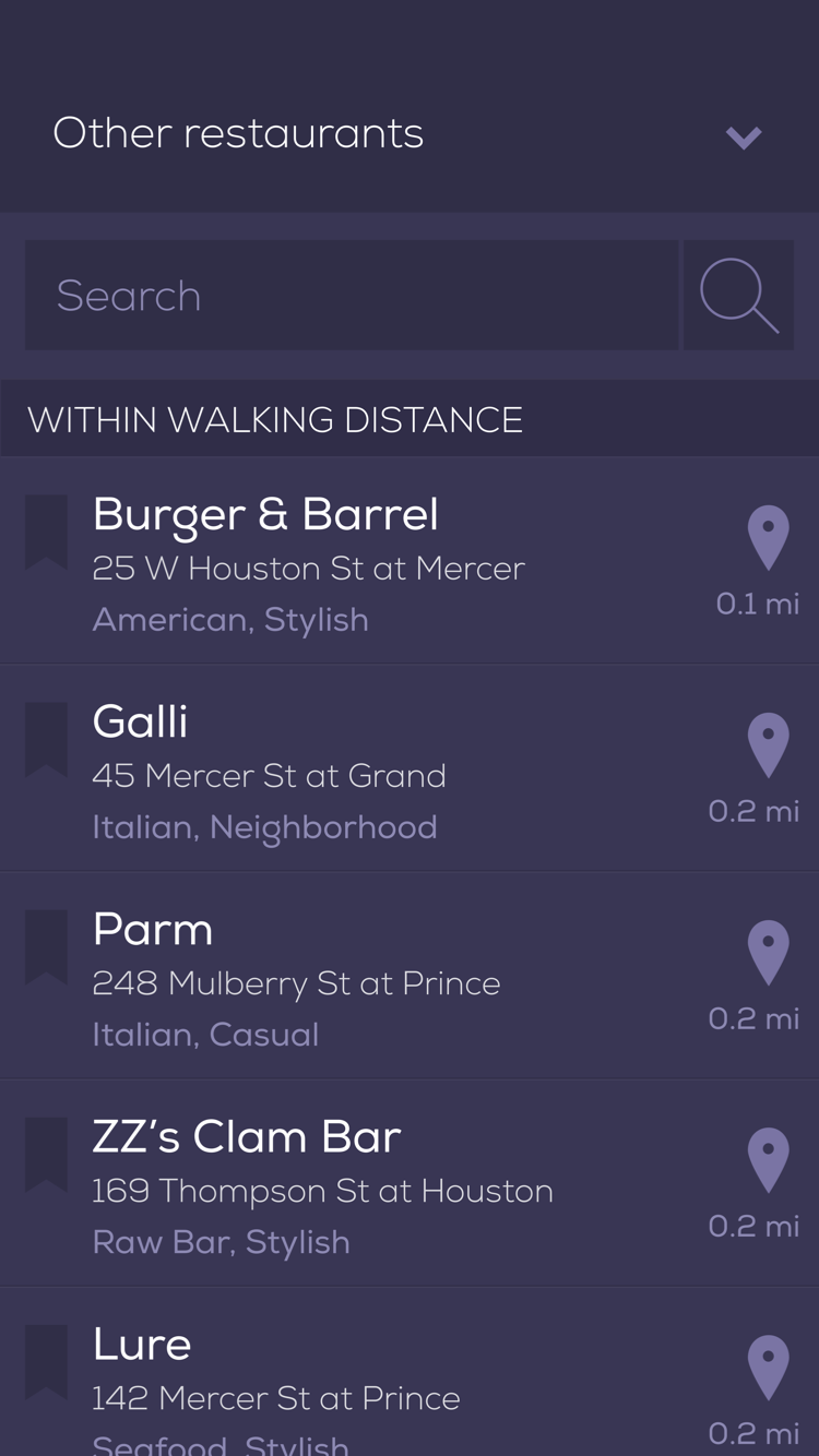
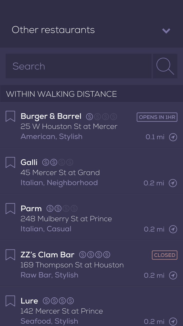
Browsing restaurants
Alongside our curated landing screen, we wanted to create a better way to sift through Cover's 300+ restaurants. Presenting a list of venues is something hundreds of apps have already done, but we found small ways to improve on the convention.
On the list view, we grouped restaurants by neighborhood sorted by proximity. It's easy to understand distance when a restaurant is a few blocks away, but further could mean a restaurant is in much different areas of a city as dense as New York.
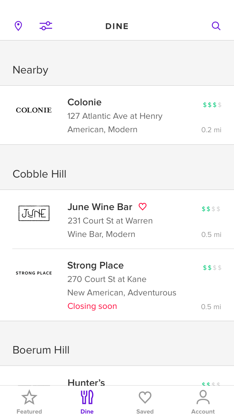
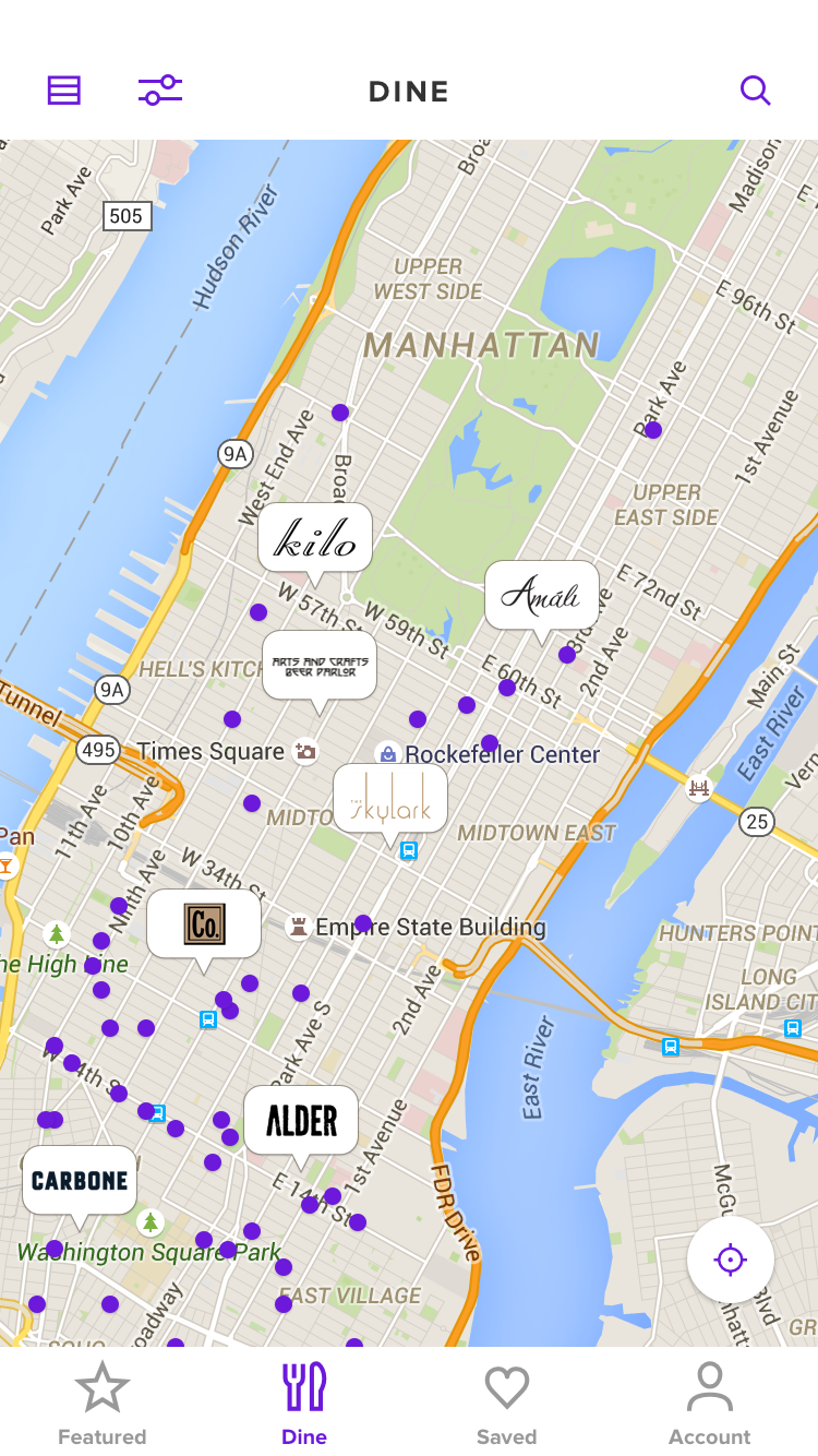
Browsing restaurants in Cover 2.0
On the map view, we used restaurant logos, which are often wordmarks, as scannable pins. Since logos are larger than a standard map pin, we carefully engineered a way to maximize the number of logos visible without too much overlap.
We also carefully chose to use Google Maps over Apple Maps or Mapbox. Apple's public transportation data was lacking at the time, so our specific audience would benefit from Google's subway information.
Research and validation
Ideas are weightless until validated, regardless of how they sound in meetings or in mockups. Since Cover's app was changing in big ways, we ran almost 20 rounds of research staggered throughout the design process.
Early in the project, we used Flinto – a tool for creating static, clickable prototypes
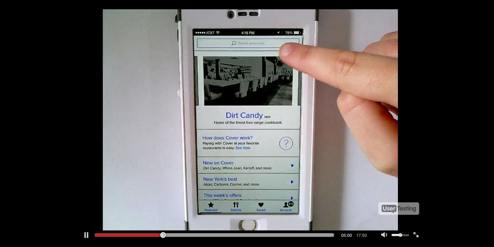
Sharing an early wireframe prototype on UserTesting.org
Early prototypes gave us an opportunity to make sure the priorities we defined earlier in the project were accounted for and in the right place. It also gave us a way to share ideas outside of the product team in a way that was easier to understand.
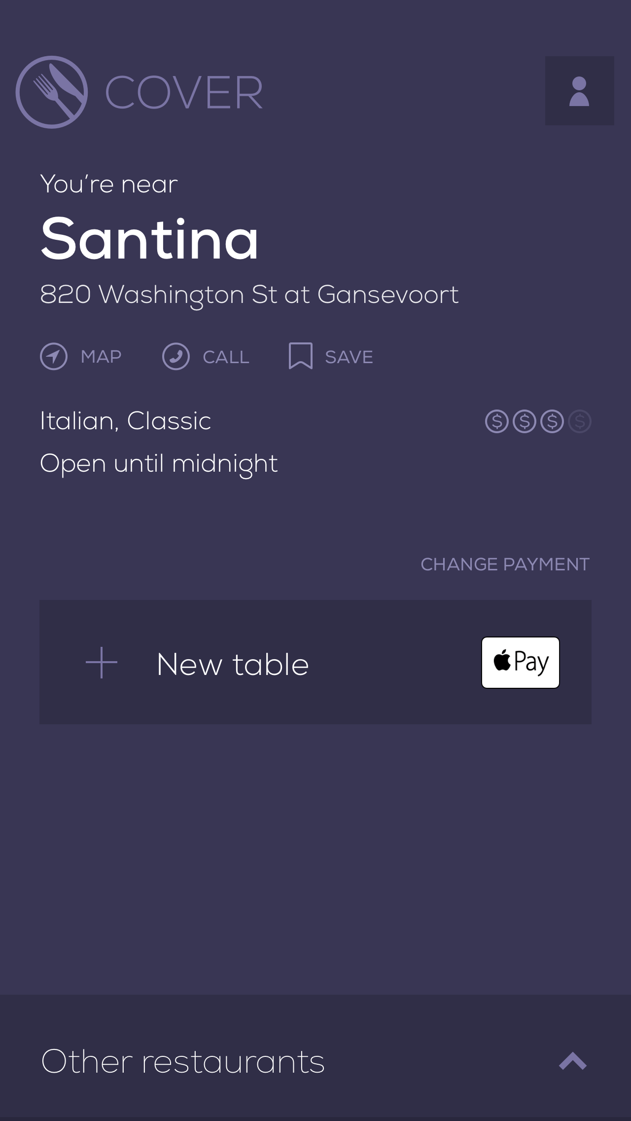
Checking into a restaurant
Most valuably, early prototypes helped us make decisions when addressing problems in Cover 1.0's payment process.
Joining a friend's table in Cover 1.0
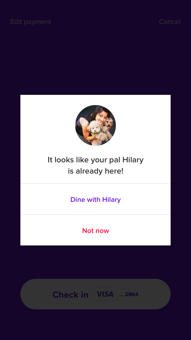
When opening Cover 1.0 in a restaurant, diners would see a list of everyone checked in. This meant it was easy to join a friend to split the check, but this approach was unscalable – especially if Cover were to expand to bars where dozens of diners could be checked in at once. Showing everyone's names and photos was also a common privacy concern.
Our solution was one of the biggest engineering challenges of the redesign.
We relied on bluetooth beacons placed near the entrance of each restaurant to determine if the diner was inside. If they were, Cover 2.0 would immediately suggest they check in.
We also removed the list of checked in diners altogether. Instead, we relied on a combination of diners' address books and dining history to suggest joining a friend immediately after checking in. We affectionately referred to this prompt as the "magic modal," and for most diners, this was the only action they needed to take.
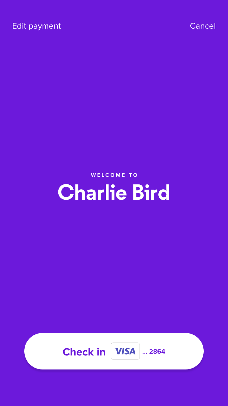
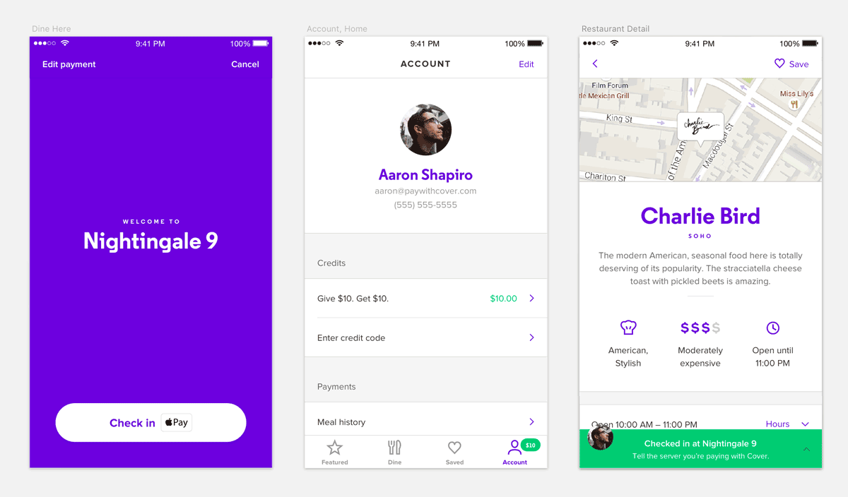
Checking into a restaurant in Cover 2.0
If a diner was too far from a bluetooth beacon or if they wanted to check into the restaurant before arriving, they could still do so from the restaurant's detail screen.
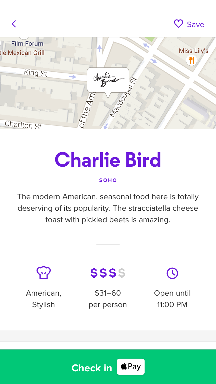
Checking in from a restaurant's detail screen
The only way for us to validate this new approach was to try it in one of our restaurants. Since Kim and I were regularly meeting with the team's engineers, they were able to create native prototypes before we dedicated time to polishing them. We started by sharing these prototypes internally, but eventually invited diners in restaurants – most of whom hadn't heard of Cover – to try them as well.
Checking into a restaurant was confusing in early sessions. Labeling the action "Pay at Charlie Bird" implied the payment would be processed immediately. People were pressing the button at the end of the meal rather than at the beginning, which we addressed by adjusting the language to "Check In at Charlie Bird".
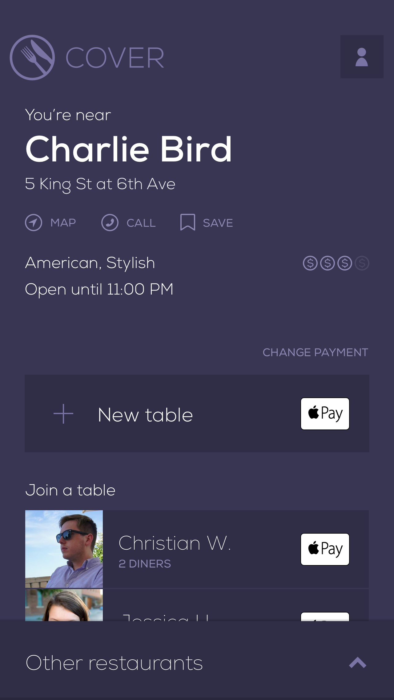
Using Cover during a meal
We also used these sessions to refine improvements to the in-meal screen for those needing to manually invite others or adjust their tip and payment information.
Since Cover doesn't send a confirmation before the check is split, knowing who is checked in at a table is important. Cover 1.0's version of this screen hid that information behind a button. Inviting friends was also tedious – especially for those with large address books – because we didn't surface people nearby or friends from previous meals.
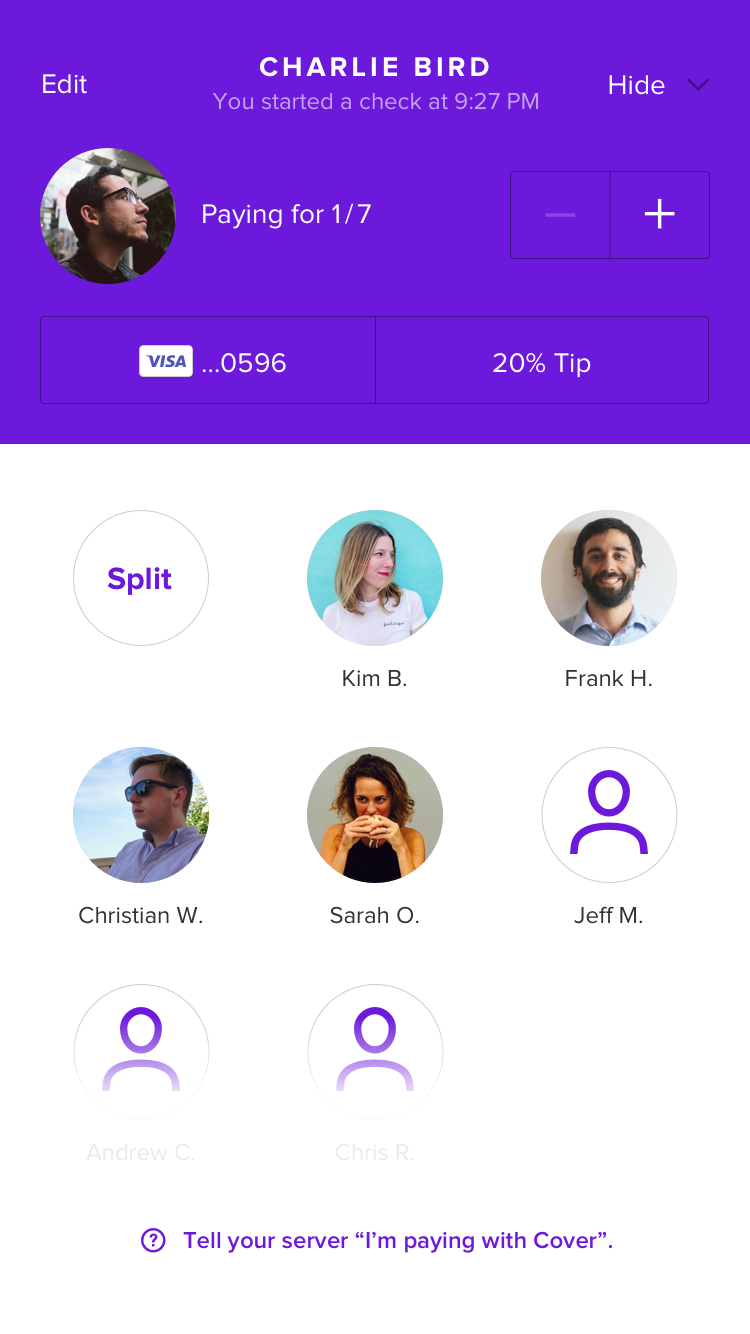
Comparing Cover 1.0's and Cover 2.0's in-meal screens
By dedicating more space to the diners checked in at a table, it became clearer who would be charged at the end of the meal. We also removed the receipt button that, when tapped on, frustrated diners with a "coming soon" note.
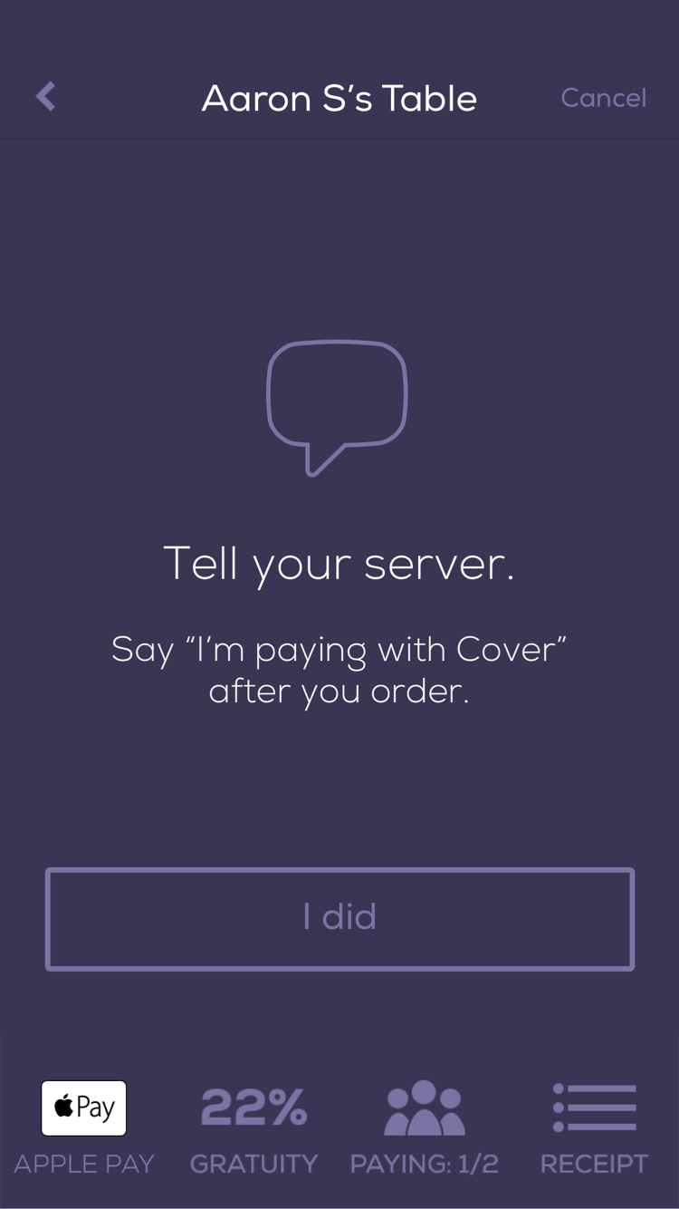
What took the most iteration through research was the feature that makes Cover most valuable – allowing people finished with their meal to leave without waiting for the check. Since we store diners' payment information on file, checking into a restaurant is all that needs to be done to apply a tip and process the payment. It's convenient, but leaving without interacting with the server can be uncomfortable.
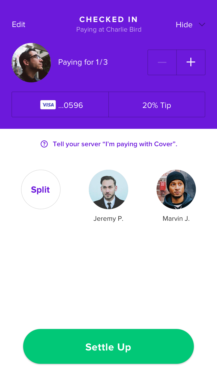
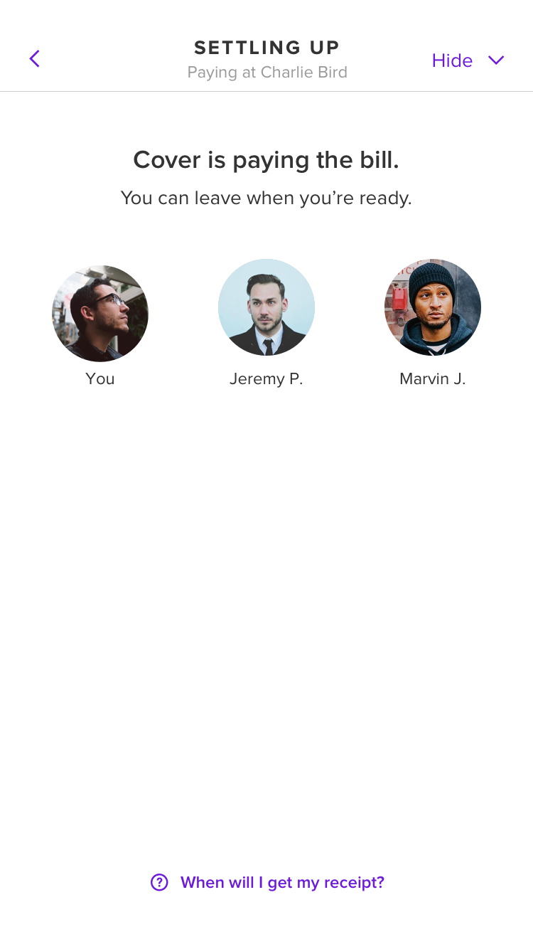
Giving diners more confidence by adding the Settle Up button
With Cover 1.0, diners were prompted to tell the server they were paying with Cover at the beginning of the meal. This caused some confusion – diners expected to see their payment was confirmed at the end of the meal, oftenen lingering to avoid leaving without paying. In the same way we iterated on the check in action, we tried different ways of communicating Cover's flow through language and ultimately created an optional "Settle Up" button to tap at the end of the meal that gave diners the confidence they needed to leave the restaurant.
Polish
When positive research sessions began to reinforce our changes to the app's structure and flow, we shifted focus to improving its presentation.
From our video shoot at The Camlin for Cover's new website
Photos and video
Our early discovery work led to a funny realization – we and many of our competitors were using the same stock imagery in our apps, websites, and social media posts. Companies like Stocksy offer options that we were comfortable using, but we decided to organize shoots to gather photos and videos that both reflected our brand and featured two of our favorite restaurants.
Cover 2.0 wasn't heavy on photography, but we found one opportunity to differentiate ourselves. New users would see our own unique photography during onboarding.
Colors and typefaces
We also tested new display typefaces in different contexts. Our choice would be used to identify each of Cover's hundreds of restaurants, so it was important to choose an option that was both unique and flexible.
Testing display typefaces using restaurant names
Color was also something we focused on late in the design process. Cover's old purple, while unique in a space dominated by red, was dark, muddy and made text difficult to read.
Testing colors on key screens
After polishing some of the app's key screens, we created a template using Sketch's shared styles that let us quickly test different color and typography options.
Refining animations with Origami
Transitioning to designing almost exclusively for iOS was tough. Since coding my first website almost 20 years ago, it's been important to have an understanding of how my work is engineered. While I've picked up a bit of Swift in my spare time, I'd found myself producing Sketch files at Cover – less hands-on than the work I did on Etsy's CSS component library in 2014.
I didn't contribute to engineering our app, but learning to create high fidelity prototypes in Origami gave me an outlet to bring designs to life with interactions and animations.
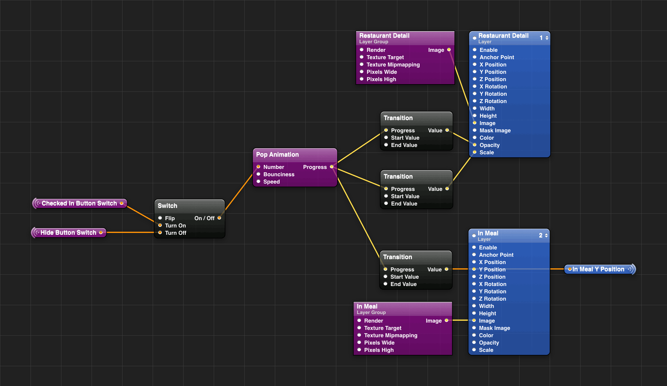
One of several Origami workspaces used to prototype animations
As design and engineering tools improve, thoughtful animations have become easier to implement. They can be eye candy at times, but when introducing new, unfamiliar workflows, nudging someone in the right direction with an animation can be a better learning tool than spelling instructions outright.
For Cover 2.0, we used a combination of colors and animations to clarify whether a screen was related to before or after checking into a restaurant.
Checking into a restaurant and viewing the in meal screen
By differentiating in-restaurant screens with more purple and by having them slide on top of out-of-restaurant screens, getting lost becomes less likely.
Transitioning from the map to restaurant details
We also improved transitioning from screen-to-screen on our map. Not only does the animation between these screens feel faster by keeping the map in place, but we draw attention to the green button by staggering its appearance.
We were strapped for time, but Origami gave us the tools to refine details like these in hours rather than days. And while we didn't rely on Origami's code exporting, being able to give engineers working prototypes that use animation curves and values mirroring those in Xcode made their real implementation much easier.
The website
While the rest of the team completed work on Cover 2.0, I began redesigning our website. It would be a quick project in order to coincide with our launch, but we wanted to do more than reskin the old website with Cover's new branding.
The existing website was long-neglected. Visually, it didn't reflect the updates Kim and I had made to Cover's brand in recent months. More importantly though, a lack of updates meant we weren't communicating some of Cover's most valuable characteristics – our industry-leading number of restaurants, our unique features like SMS invites, and the experience of our team.
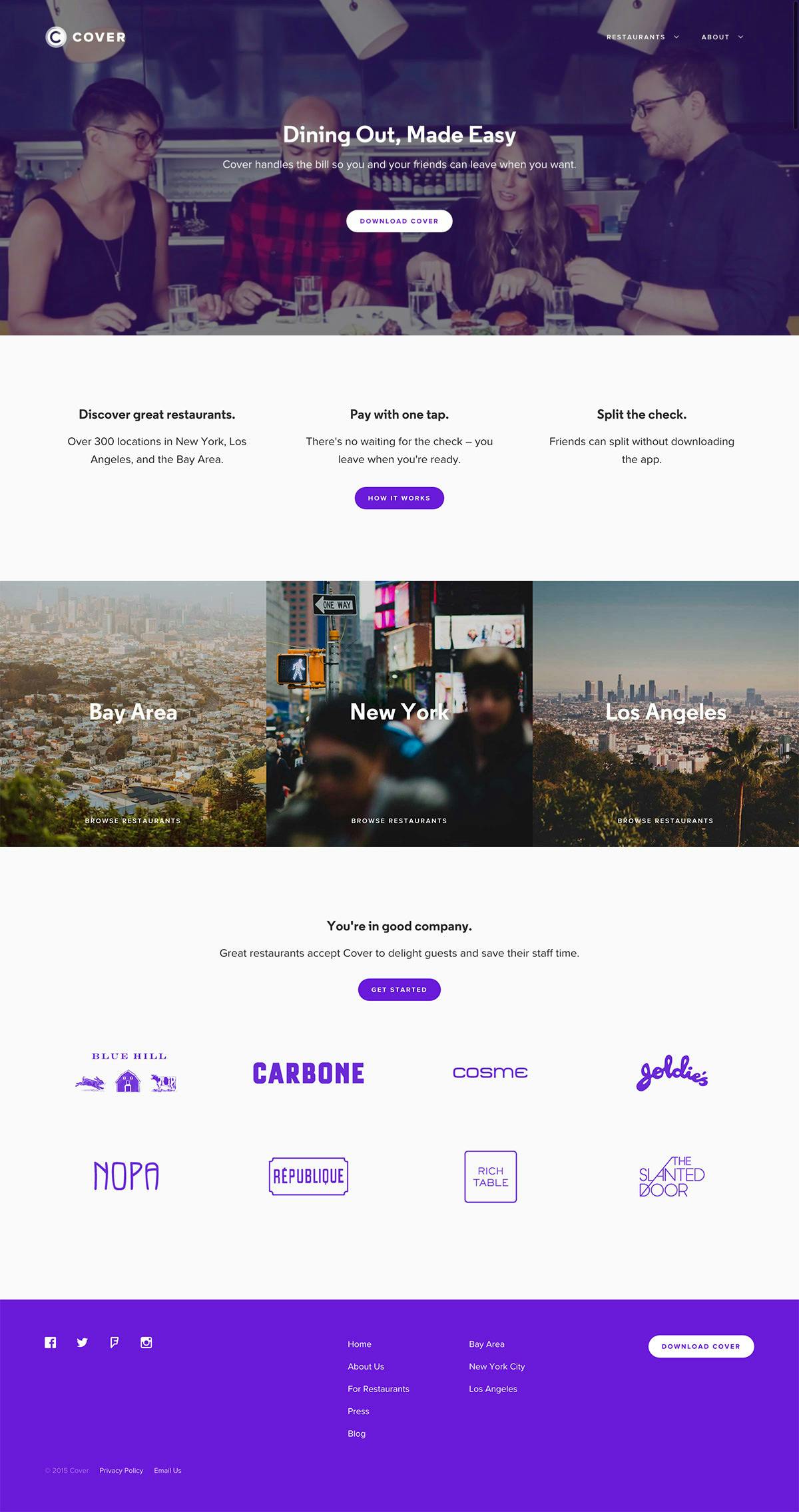
Cover's new home page
Alongside the new home page, I created additional pages that communicated our culture and history, offered downloadable brand assets, and spoke directly to prospective restaurants.
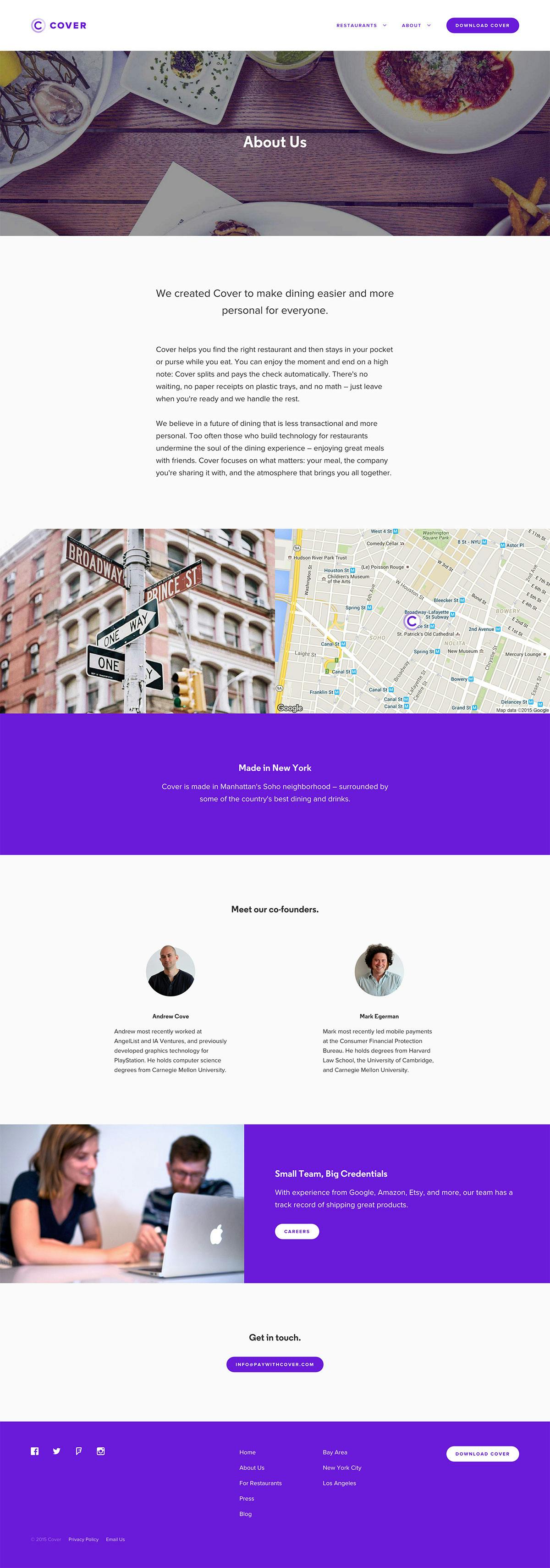
Cover's new about page
During my last year at Etsy, I lead an effort to replace aging CSS with a new library of modular components. Using similar methodology, I styled Cover's new website using flexible, object-oriented styles that we were able to use for both paywithcover.com and our app's web views.
Modular CSS components
Thanks
Because we were such a small team, I'm proud of what we were able to accomplish in only a few months. Embracing ideas and feedback early in the design process from our operations team, diners, and restaurant partners helped us find and validate great solutions more quickly and effectively than we would have alone.
Most importantly though, we created something for the right reasons – to make great meals with friends and loved ones even better.
Special thanks to our team who worked hard to make this all happen – Kim Bost, Frank Harris, Christian Whitehouse, Chris Rotella, Jeff Manian, Robbie Mitchell, Arielle Shipper, Sarah Arnold, Michelle Capocefalo, and Sarah O’Mealia.