Work > Patreon
A design system for the future
I loved working in media, so leaving VICE in 2020 was a tough decision. Our reporting had real world impact – something that isn't always the case in tech. Newsrooms are struggling though. As our budgets dwindled, I began to wonder how I could contribute to important storytelling and reporting elsewhere.
When I had the opportunity to join Patreon – a company whose mission is to help writers and other creators make a living doing what they love – it was a natural fit. If news companies couldn't support great writing, maybe Patreon could.
Patreon can feel like a startup, but it was founded over a decade ago. A lot changes over a decade. Trends fade. Features go unused. Code gets stale. My role at Patreon was to guide product, design, and engineering teams in an effort to clean up a decade of cruft and reimagine their existing design system, which we called Studio.

Studio, the Patreon design system
I've been responsible for several design systems, but what made this project unique was that Patreon was working on an upcoming rebrand. Our updates to Studio needed to improve on our existing visuals today while being flexible enough to adopt the new brand's visuals at a later date. This meant much of my time would be spent juggling the team's current needs while preparing us for tomorrow.
Foundations
Designers have been using variations of Brad Frost's atomic design methodology for a decade to organize their design systems. Later, design tokens were innovated to store smaller attributes that could be repeated in different contexts. We leaned on these conventions for Studio when it made sense to do so, but also adopted unique processes to speed up our workflows.
Design tokens
Rather than creating color and typography styles directly in Figma, we used a plugin called Tokens Studio. This tool helped us create design tokens that could be used in both mockups and production.
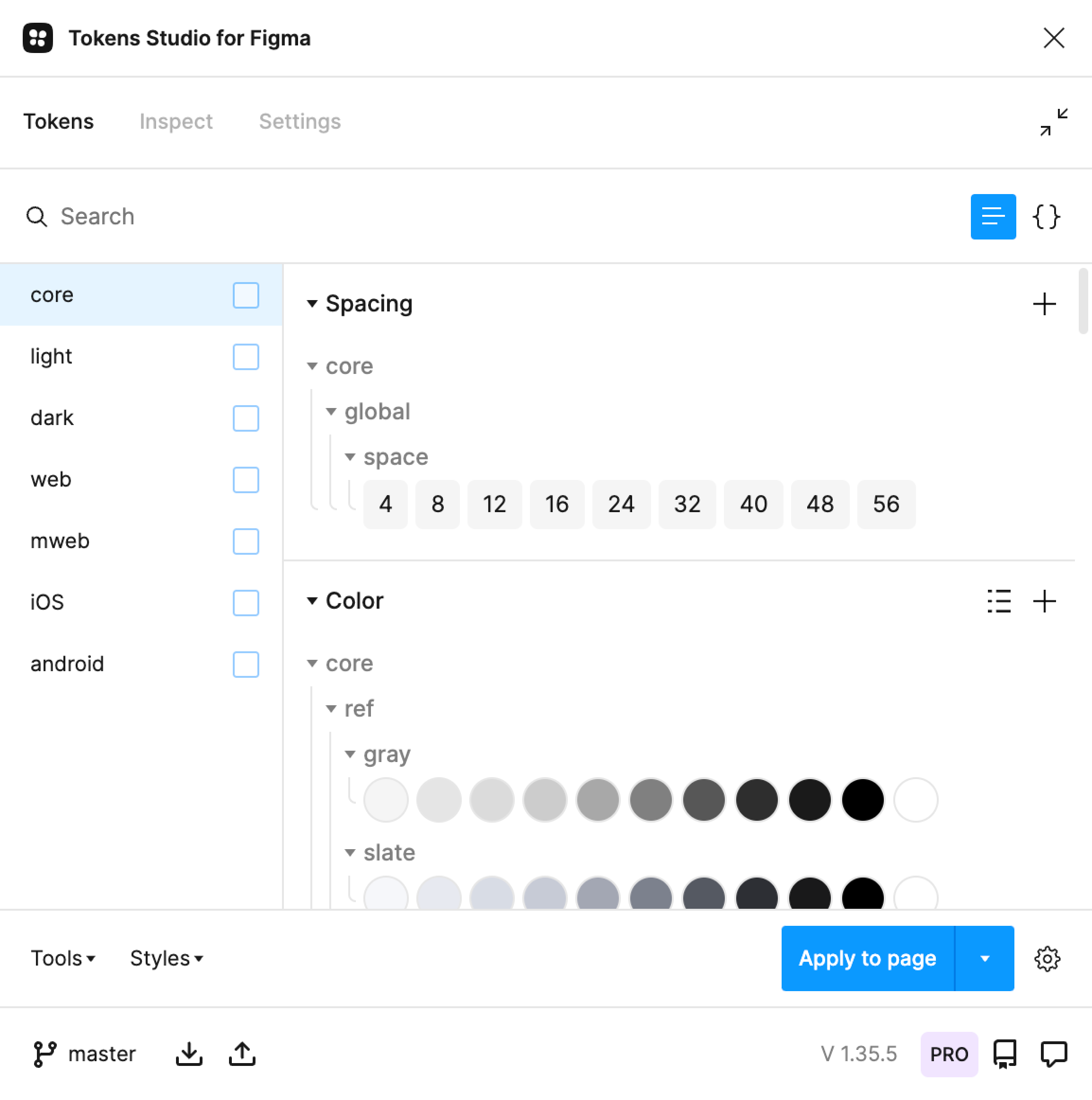
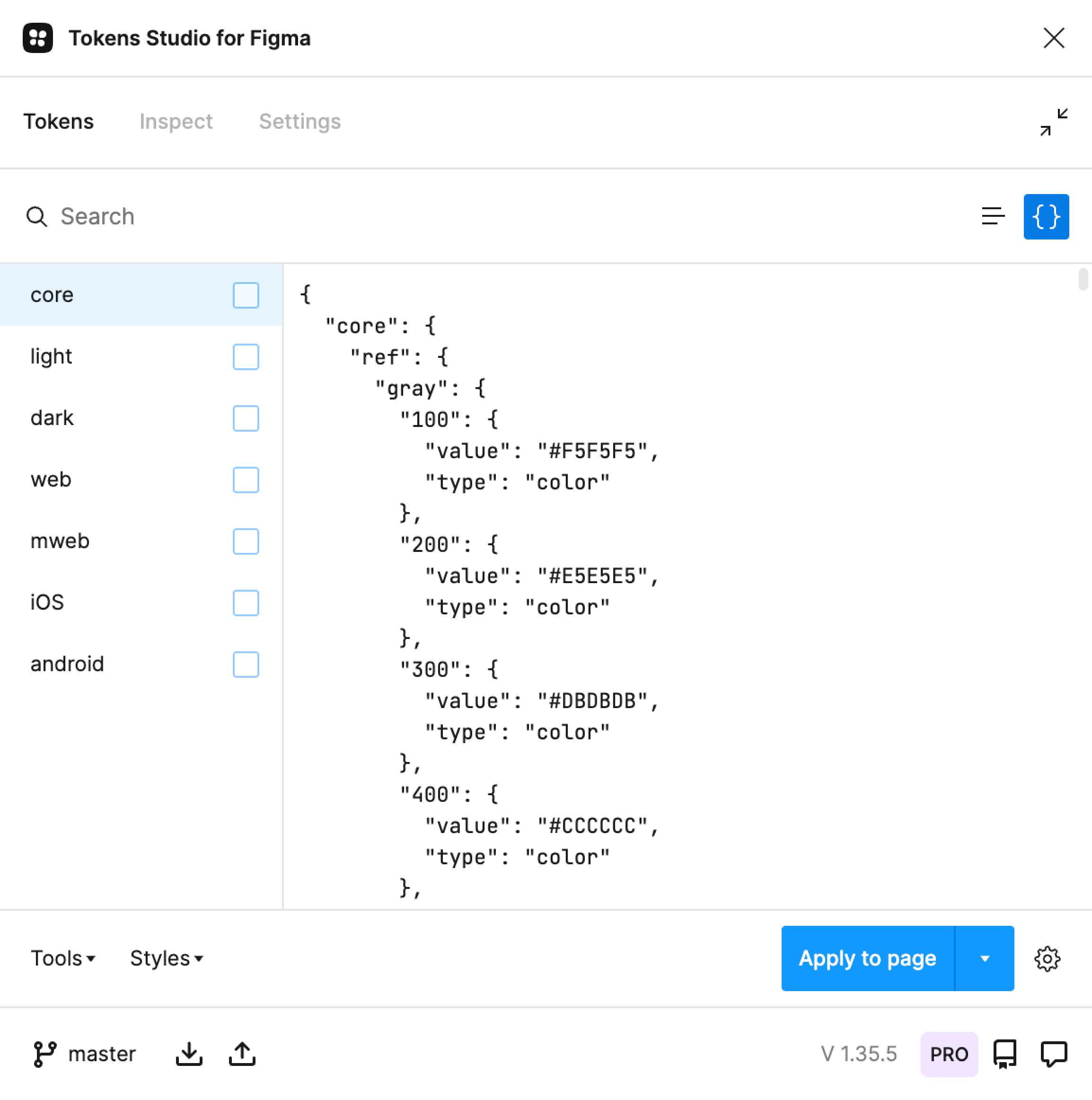
Tokens Studio
Tokens Studio did three things:
- It allowed us to define common values that Figma doesn't support natively, like spacing and border radii.
- It translated design token values to Figma styles. This ensured designers were using the same values in their mockups that engineers were using in production.
- It saved and exported design tokens to a Github repository, allowing us to use Style Dictionary to translate token values to any language.
I considered manually creating design tokens in code, but using Tokens Studio meant any designer with a basic understanding of our Github workflow could contribute when I was unavailable to help. Tokens Studio was our source of truth.
Figma styles generated by Tokens Studio
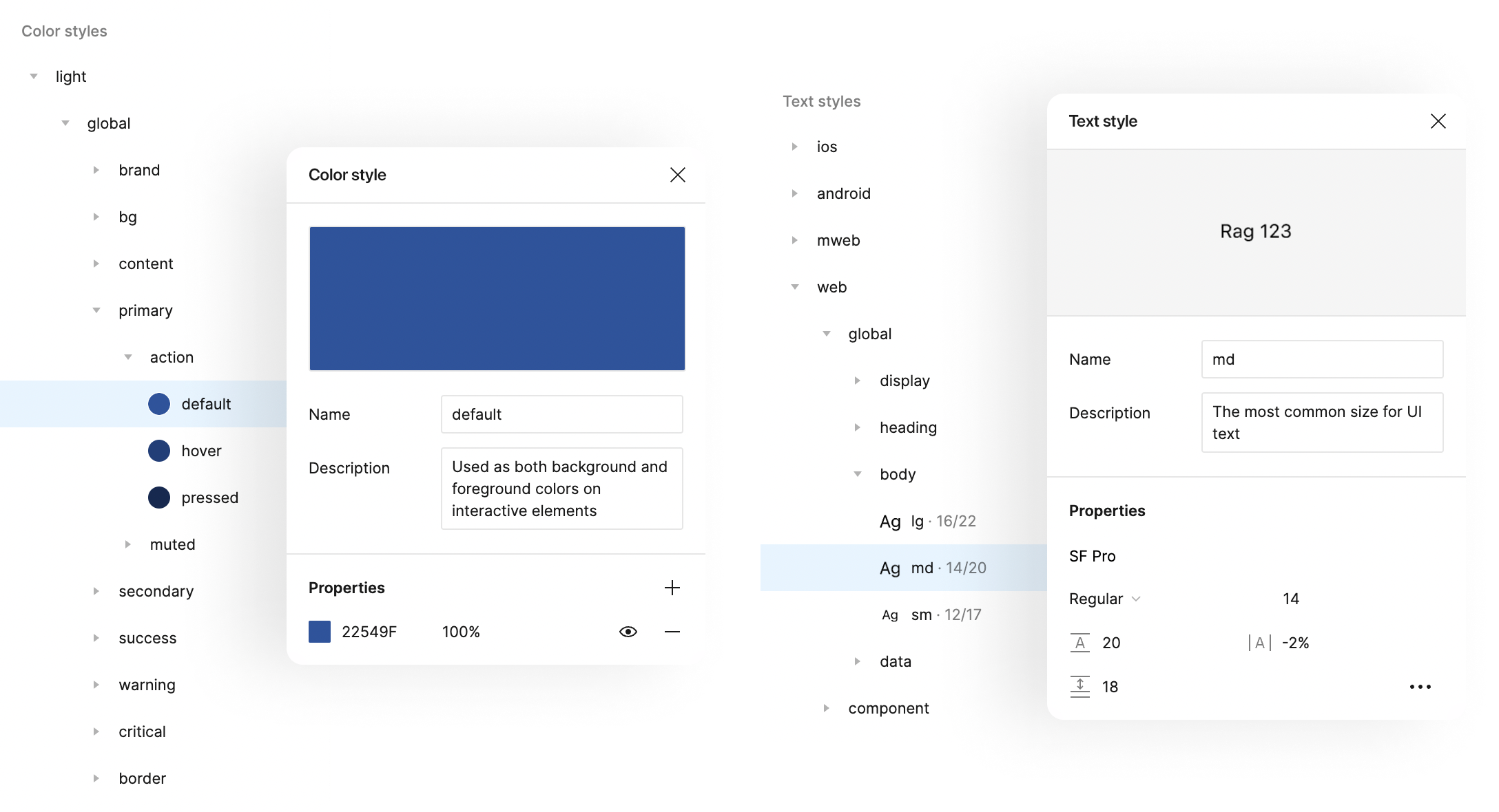
Opening Tokens Studio to reference design tokens still felt tedious, so I documented our tokens in Figma as well.
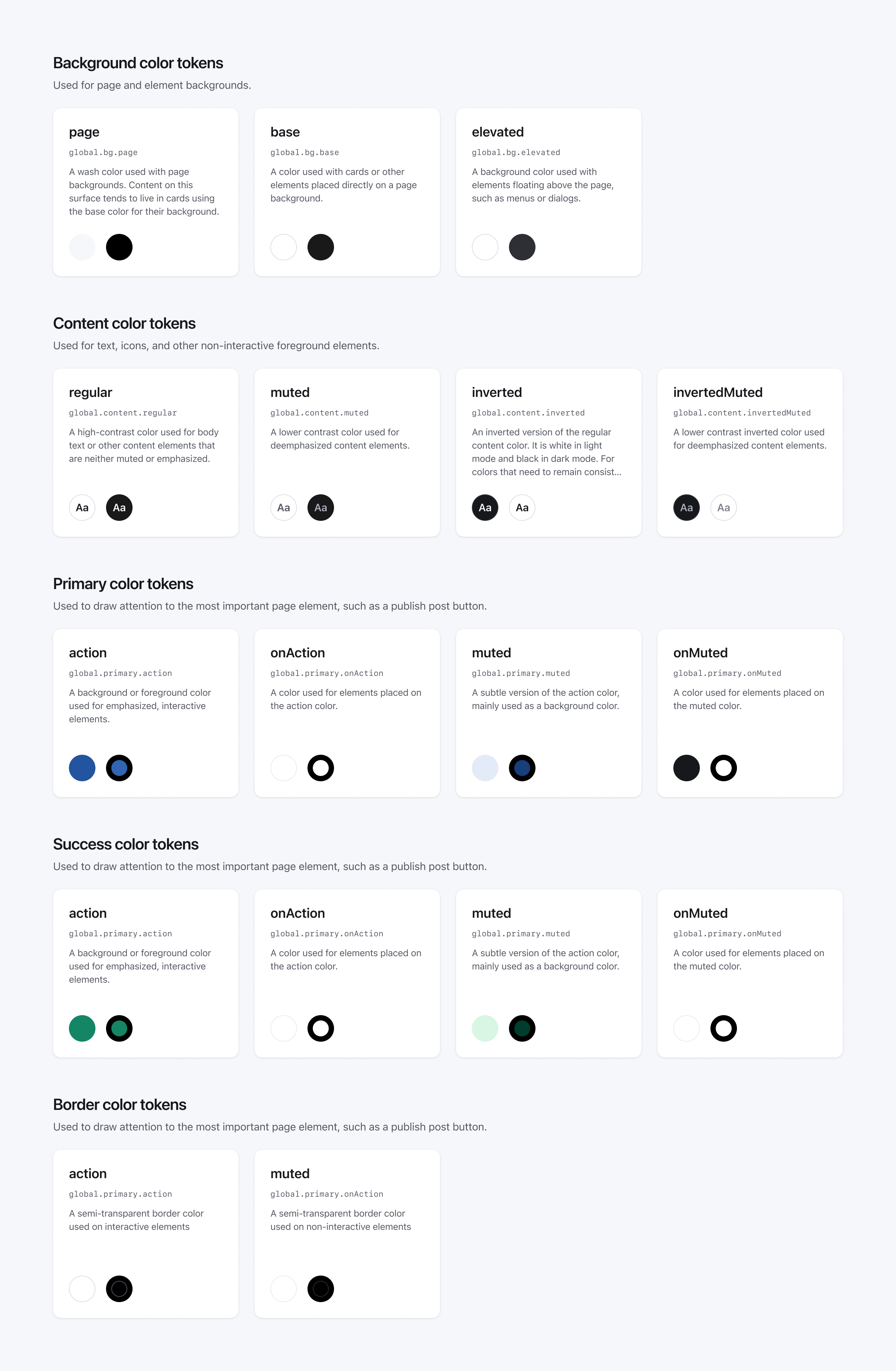
A subset of color tokens documented in Figma
We only had a handful of designers on the team, so we frequently worked on features across each of our platforms simultaneously. It made sense for design tokens to be shared across those platforms. Our tokens allowed for small exceptions, such as typography styles being made to feel native on Android and tap targets expanding on smaller web breakpoints.
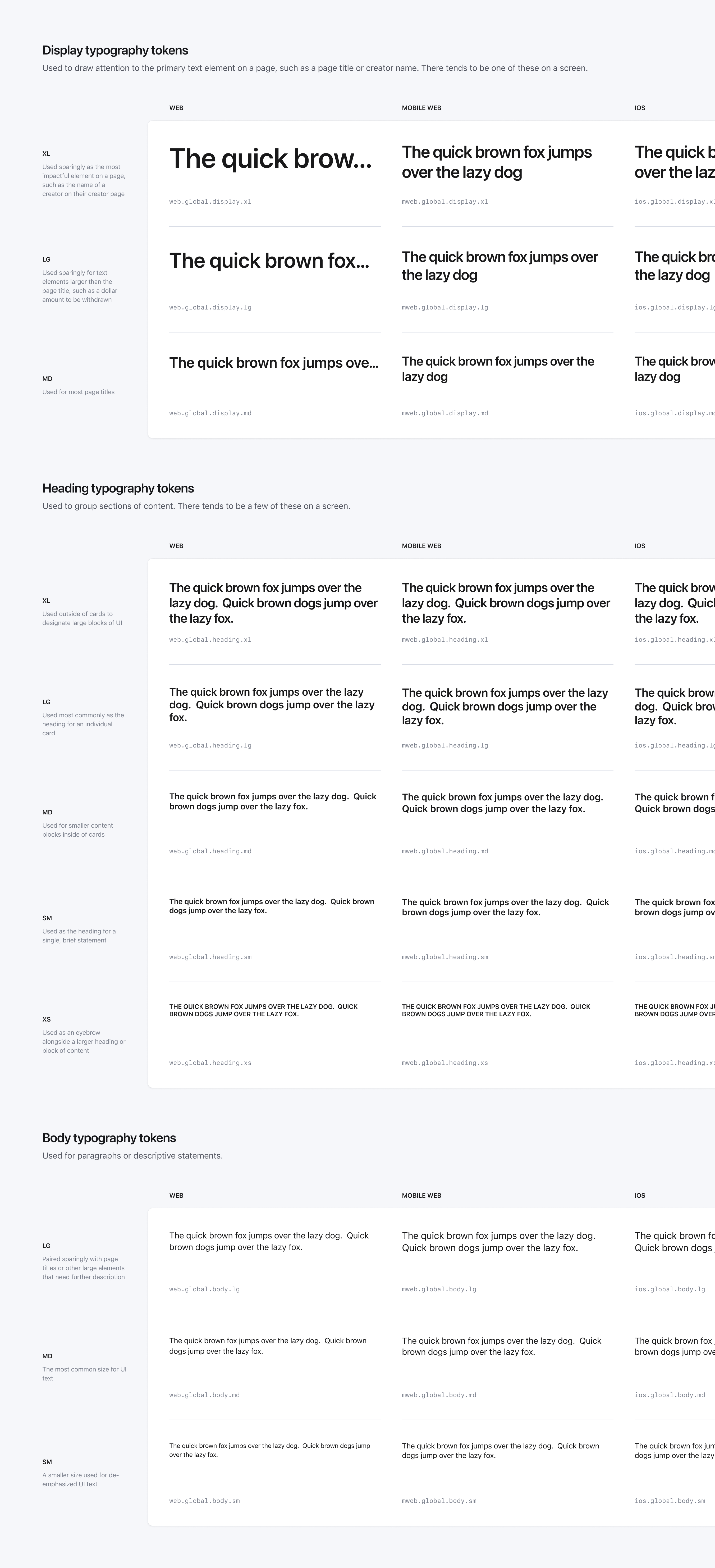
A subset of typography tokens documented in Figma
I named tokens semantically, providing guidance for designers who might otherwise make subjective decisions based on personal preference.
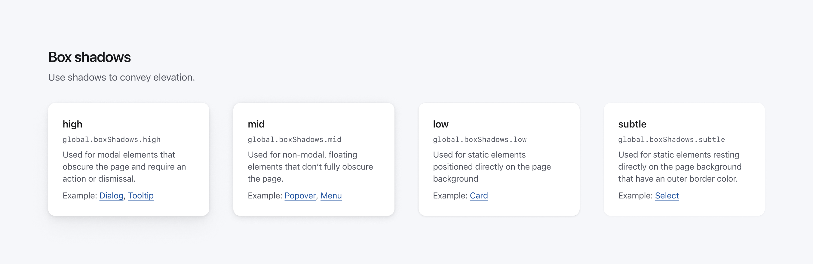
Box shadow tokens documented in Figma
Studio was organized into three Figma files:
- The foundations file is where we documented color, typography, and shadow styles generated from Tokens Studio. This was also where we stored our grids, icons, and Studio's other underlying elements.
- Reusable UI elements such as buttons, form fields, and dialog boxes were stored in our components file. Components were simple, data-agnostic blocks of UI that could be used in different layouts or features.
- More complex UI elements such as site navigation, our video player, and content cards were stored in our templates file. These were less flexible than components, but were still repeated across many screens.
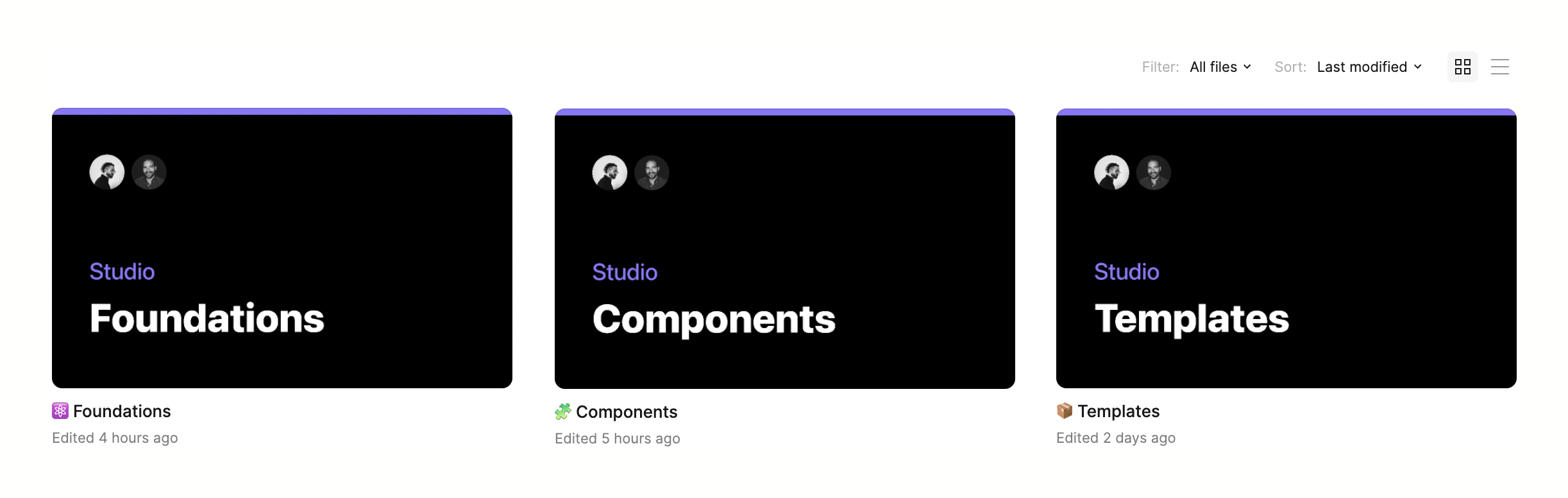
Figma files
Theming
Enabling dark mode was one incentive to apply our new design tokens and components across our products. Each of our color tokens had both light and dark variants, making it possible to toggle between the two.
The creator page in light and dark modes
Accessibility
One benefit of a design system is built-in accessibility. I tested every combination of color and typography tokens for WCAG AA contrast. Designers work would always meet our contrast standards as long as they used our design tokens. I also worked with our engineers to ensure our components used appropriate alt text, supported keyboard navigation, and included built-in ARIA roles and attributes.
A small subset of color token contrast tests
The secret sauce
Search for design systems on Figma Community and you'll find dozens available for download. They're available in any style, across any platform, and with continued support from the designers who created them. It's never been easier to quickly create designs for a prototype.
These free design systems can be a good starting point, but using them binds you to the decisions of a designer who isn't embedded with your team. Even common patterns like buttons and dropdown menus will require unique variations as a product matures. For teams, a design system's secret sauce comes from building processes unique to how they collaborate and components unique to the problems they solve.
Icons
Gabe and I drew over 300 new icons – each with solid and outlined variants. Buying or commissioning an icon set wasn't an option since many of our icons were unique to membership on Patreon. It took awhile, but there's something meditative about meticulously drawing 24 pixel images – especially as unique visual patterns emerge.
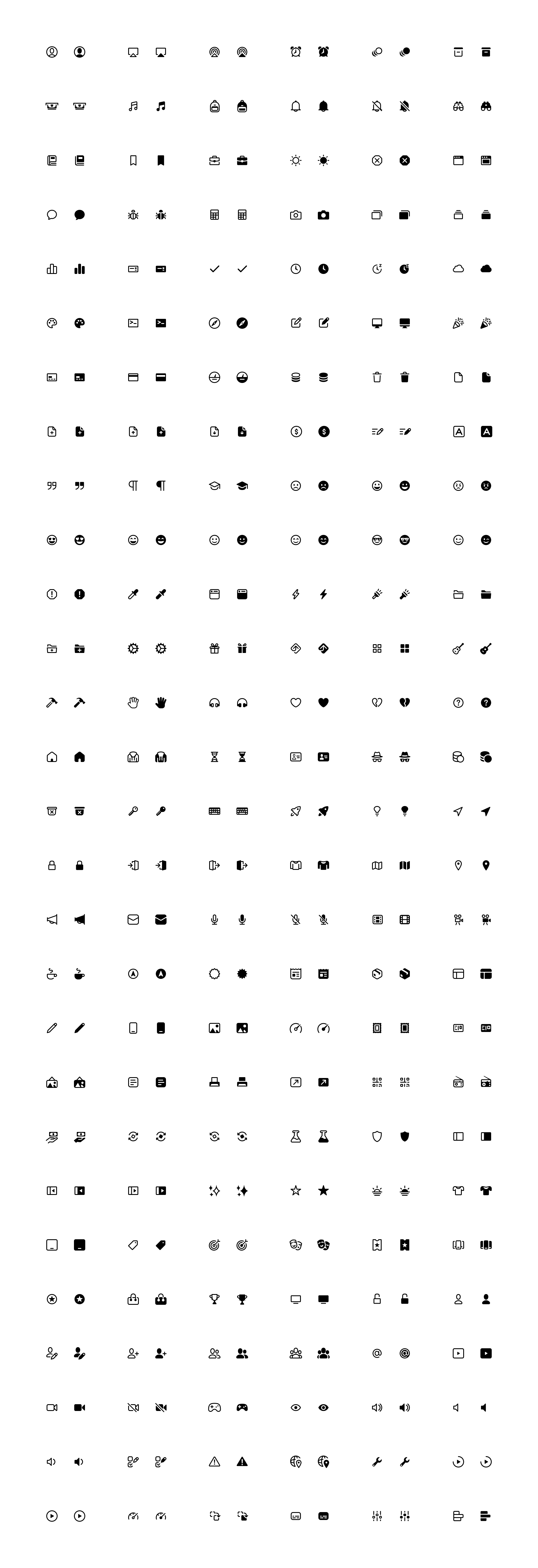
A subset of icons from our icon set
To make it easier for designers to search for icons, I made each icon an component and included synonyms in their inline documentation.
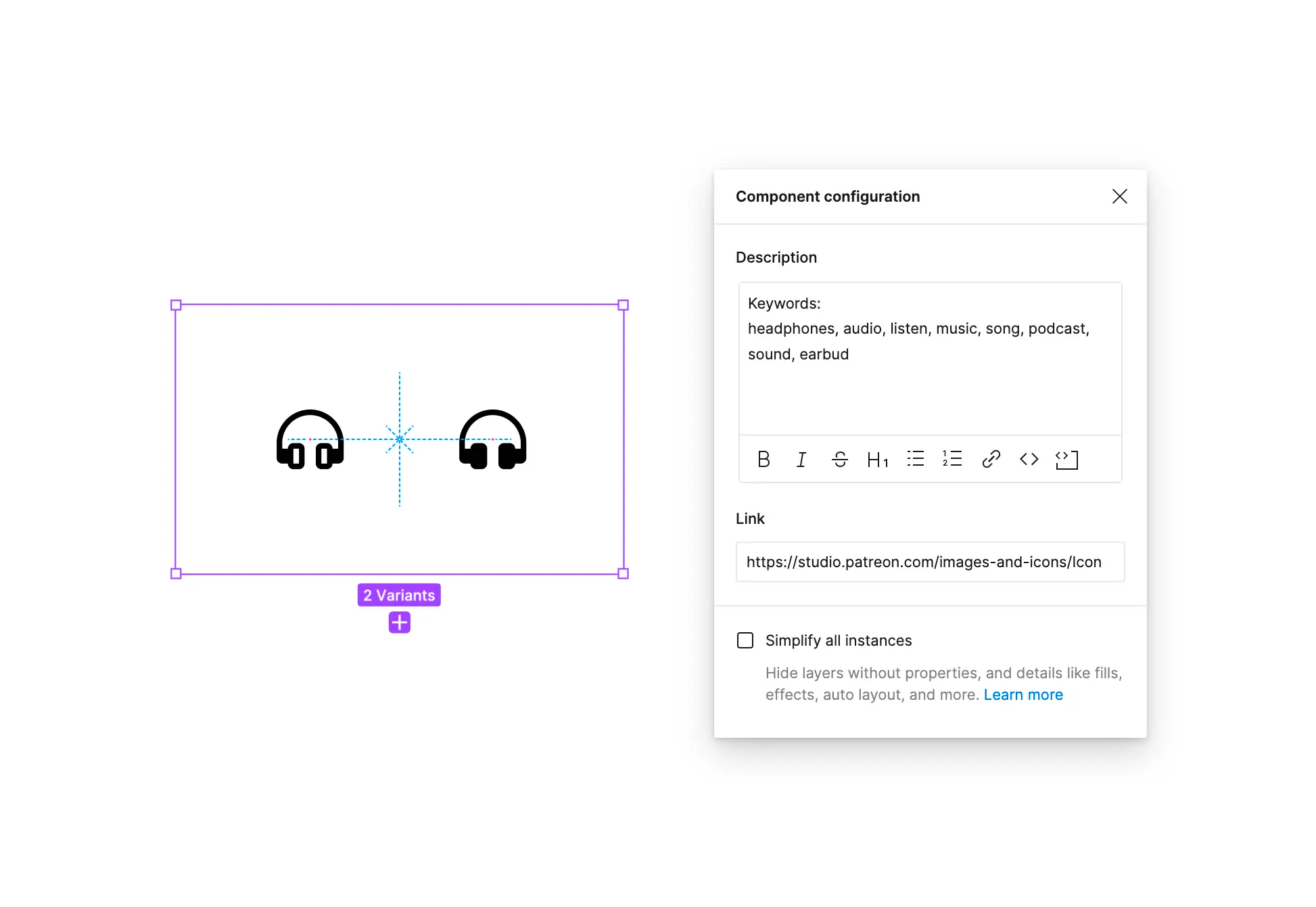
An individual icon component
Exporting image assets from Figma and distributing them to engineers is tedious. We built a custom workflow using the Figma API to automate this process. Each time a designer published changes to our Figma file, SVGs were generated and deployed to a Github repository. Much like our work with Tokens Studio, this gave us confidence that designers were responsible for our source of truth.
Real data
I've mostly worked with companies who host user-generated content, so I've developed a grudge against unrealistic placeholder text and images in mockups. Designs at Patreon needed to accommodate all of our creators regardless of whether they had access to beautiful imagery. Who are we to determine what's beautiful anyway?
Jasmeet and I created a Figma plugin make it easier to fill our designs with real creators' branding. The first version of our plugin let designers search for specific creators or select a creator at random, making it easy to fill mocks with a range of content. At the time of my departure, we had also developed a working beta that also imported a creator's post content, allowing designers to generate feeds or post detail pages.
Our custom asset finder plugin for Figma
Components
I built dozens of unique components from scratch. Some, like our badge component, were simple – only containing a few variants.
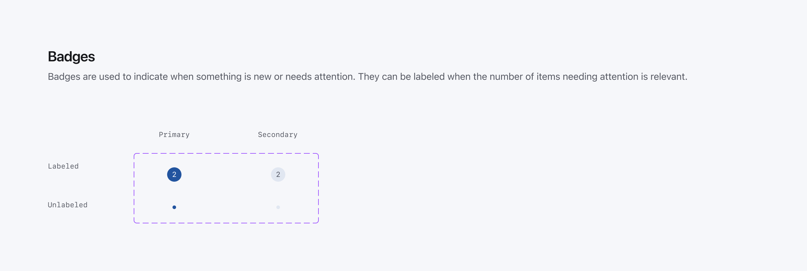
The badge component
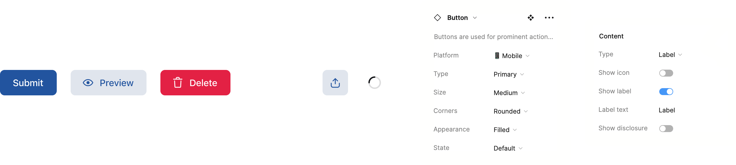
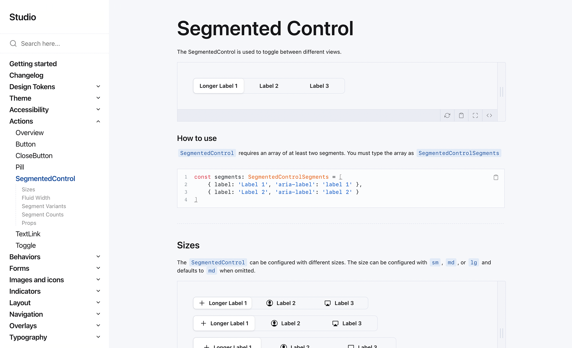
Other components were more complex. Our button component had over 300 variants, giving designers access to different sizes, appearances, and platforms.
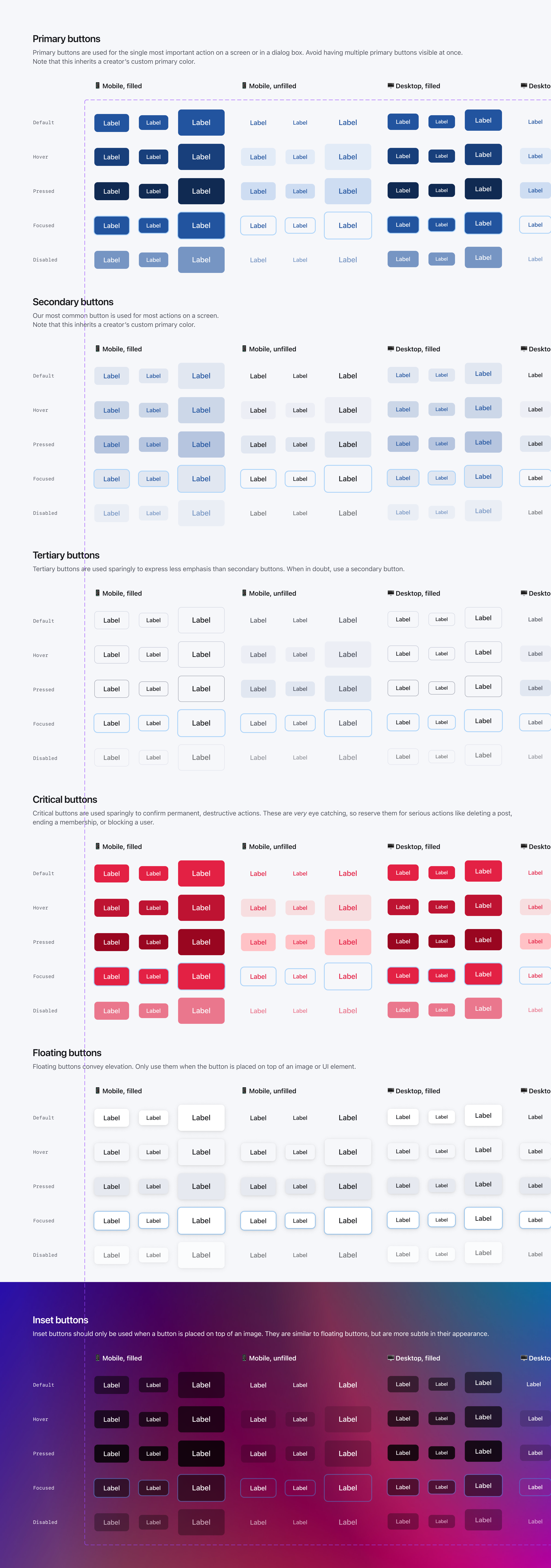
The button component
Our button's child component allowed designers to combine text, icons, and loading indicators along with the parent button's size, appearance, and platform variants.
Button examples
Our navigation component was similarly complex. It had fewer top-level variants, but was split across several nested components.
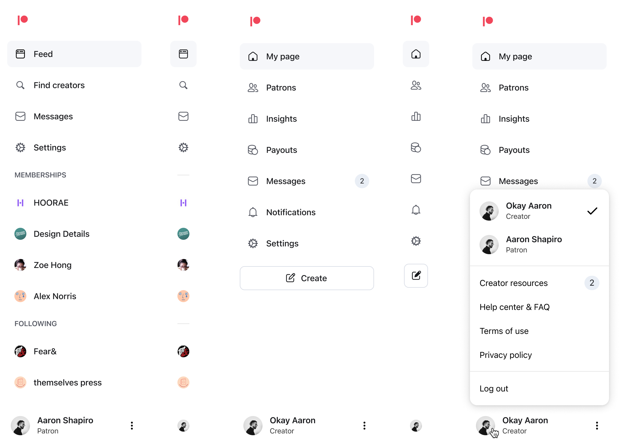
Some configurations of the navigation component on desktop
I surfaced nested components' properties in their parent component's properties panel. This made it easier for designers quickly access any property without having to memorize which component the property was attached to.
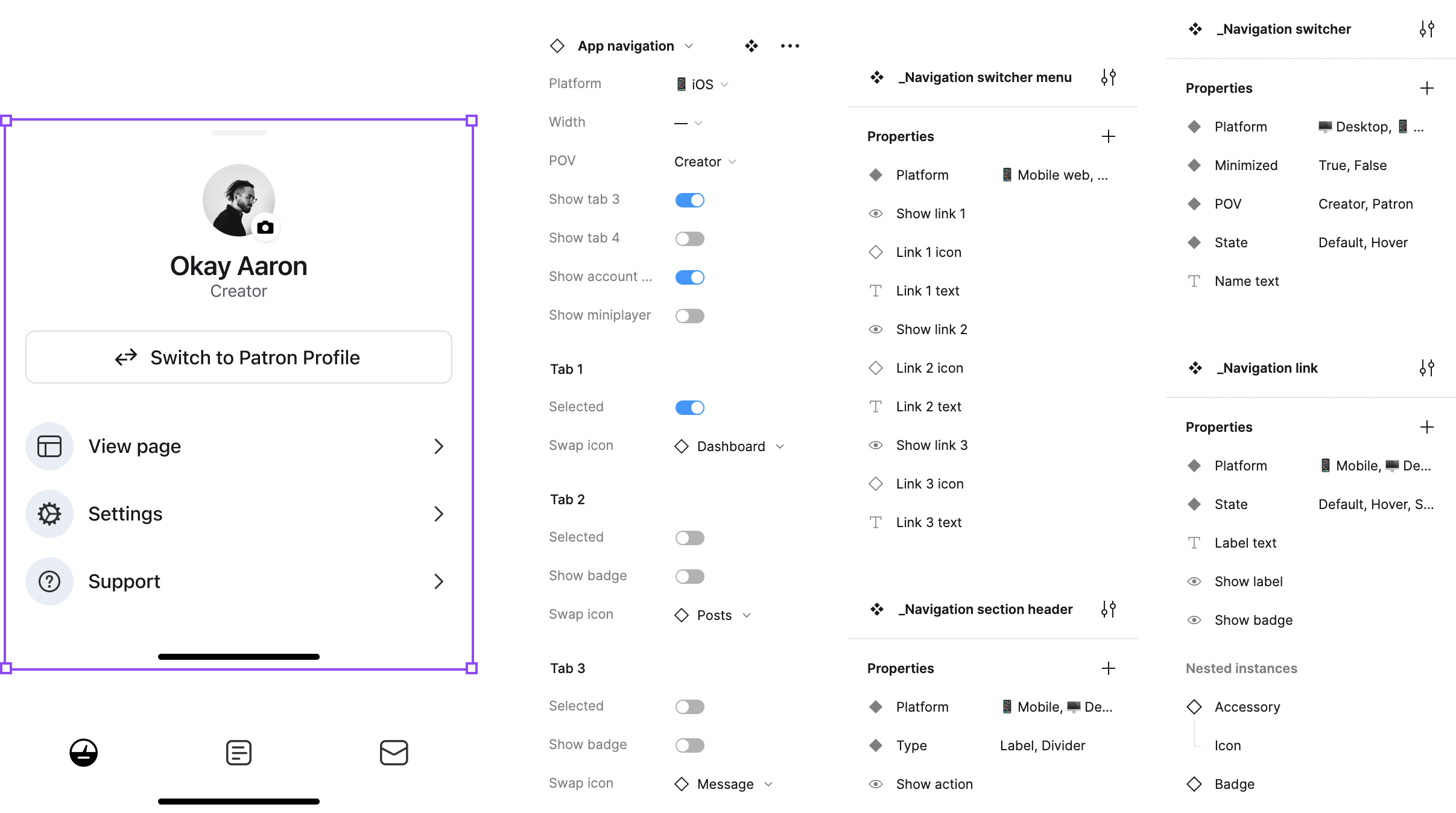
The navigation component on mobile
Many components were unique to Patreon and were product design projects in themselves. Our cards were one component with significant variations. Their appearance changed based on the content type (text, video, audio, etc.), who was viewing the card (patrons, non-patrons, the creator), and context (large cards for consumption, small cards for tools and playlists).
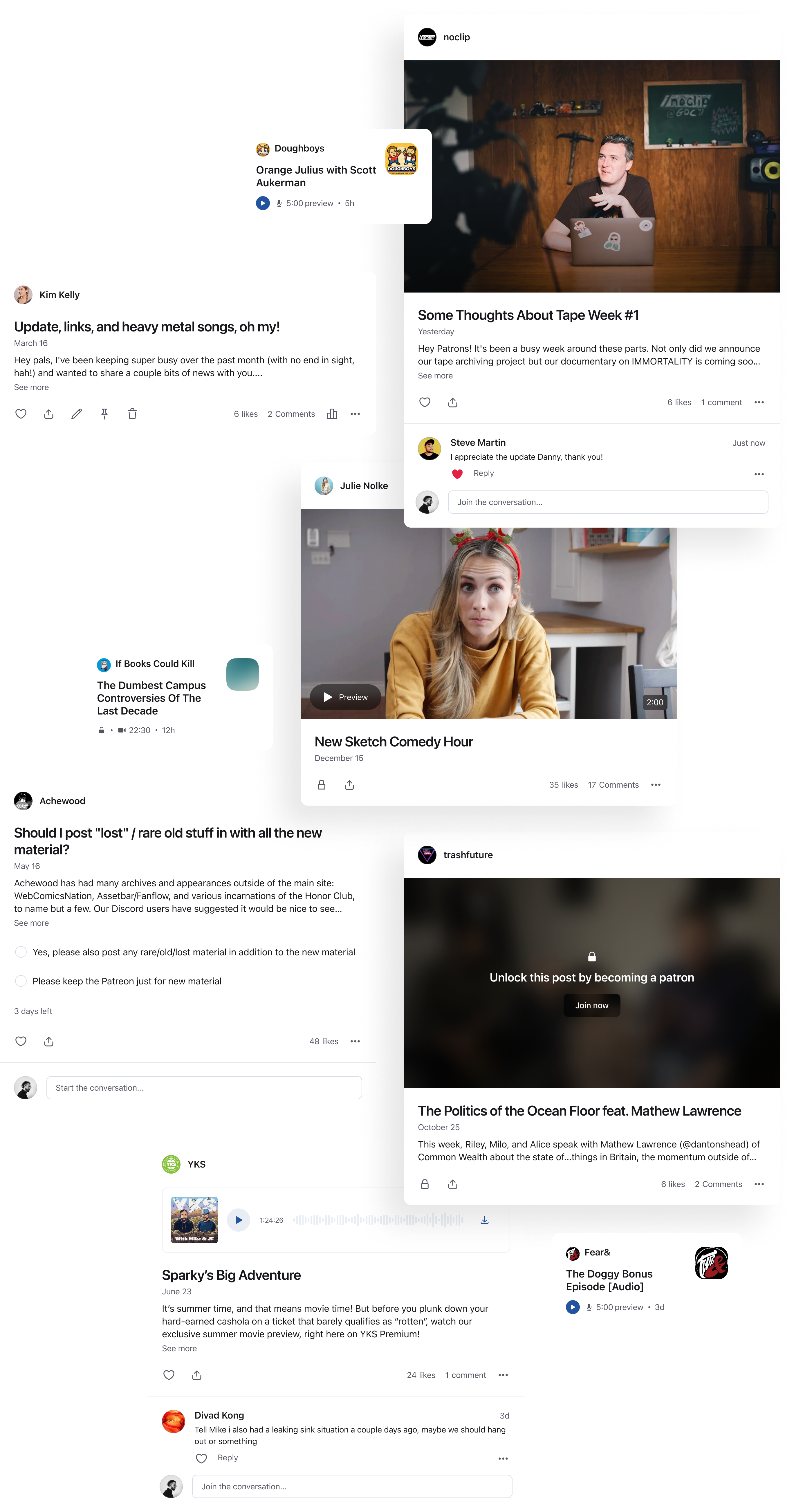
Some configurations of the post component
Alignment
A design system is only as good as a team's discipline in using it. I didn't want to be the component police, so it was important to develop a sense of collective ownership – even if I was the designer responsible for most of it.
Documentation
Figma's support for inline documentation has improved over the years. Our files were meticulously organized and each component had inline descriptions, making them easy to understand in context without having to consult documentation elsewhere.
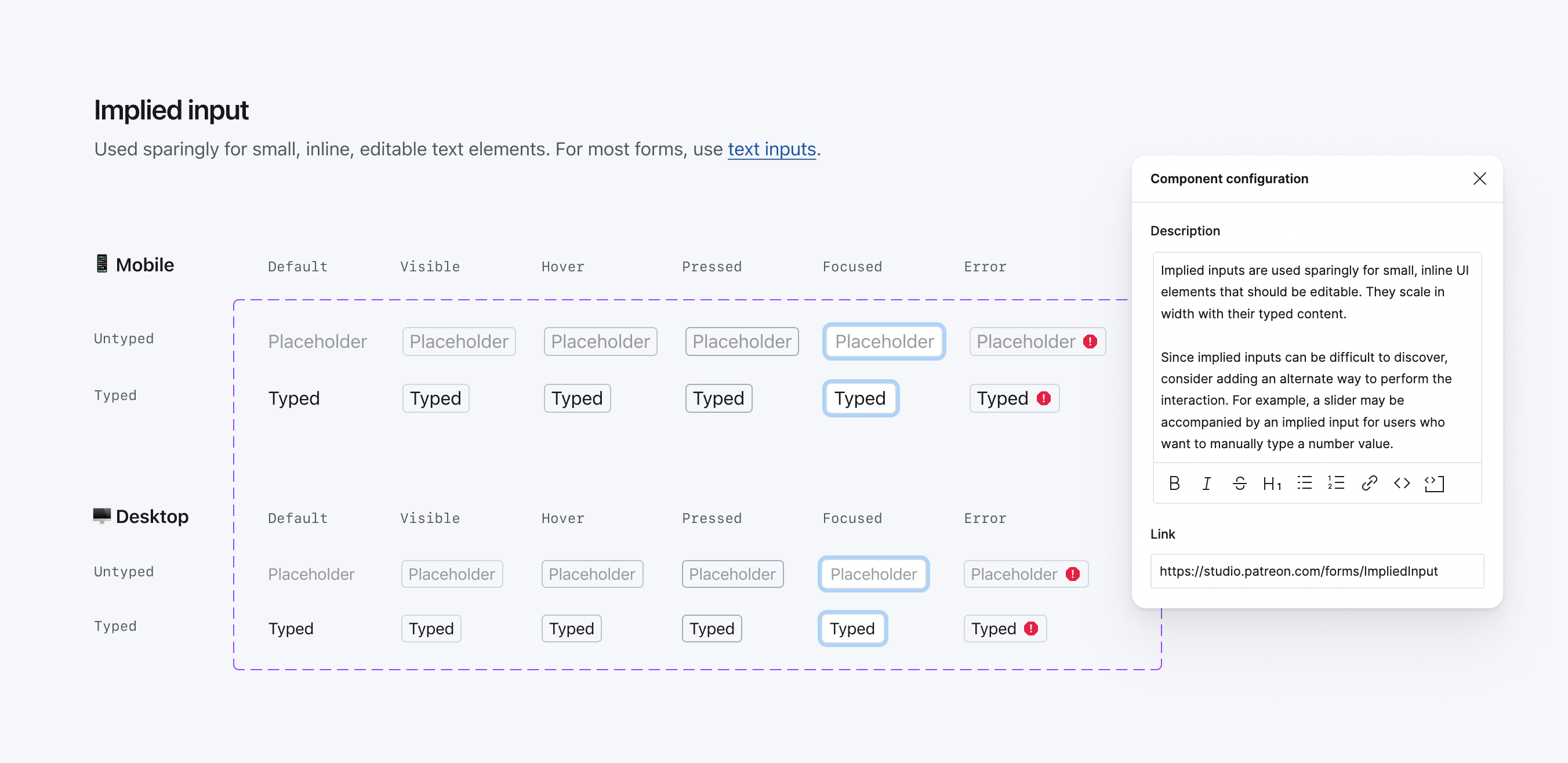
Inline documentation for the implied input component
I created examples and best practices for each component. We encouraged experimentation, but having access to these guidelines helped designers use components consistency.
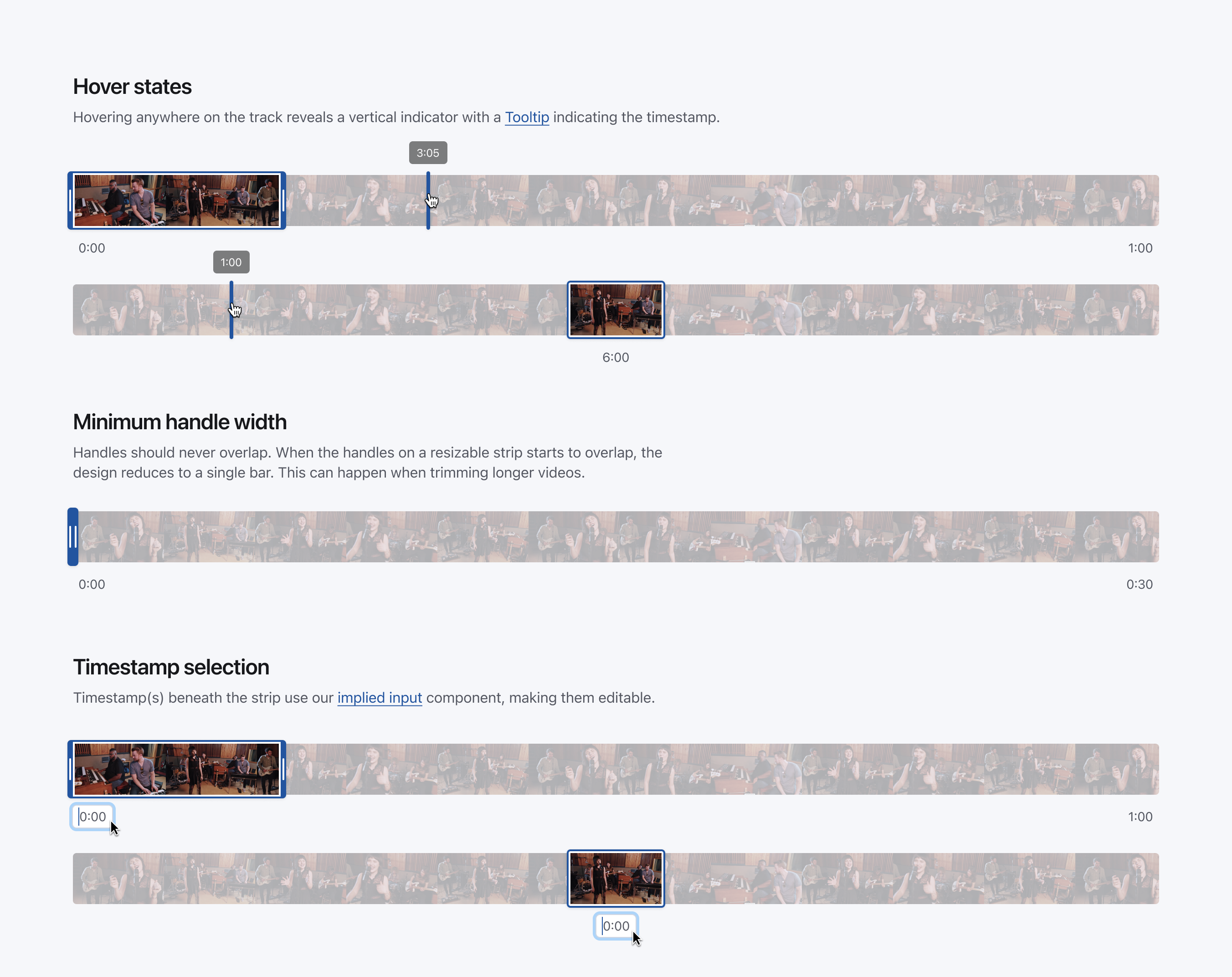
Example usage for the strip component
Figma isn't always the best format for longform documentation. I wrote thousands of words of documentation in Notion. This was useful for onboarding new designers and giving engineers context for how we work.
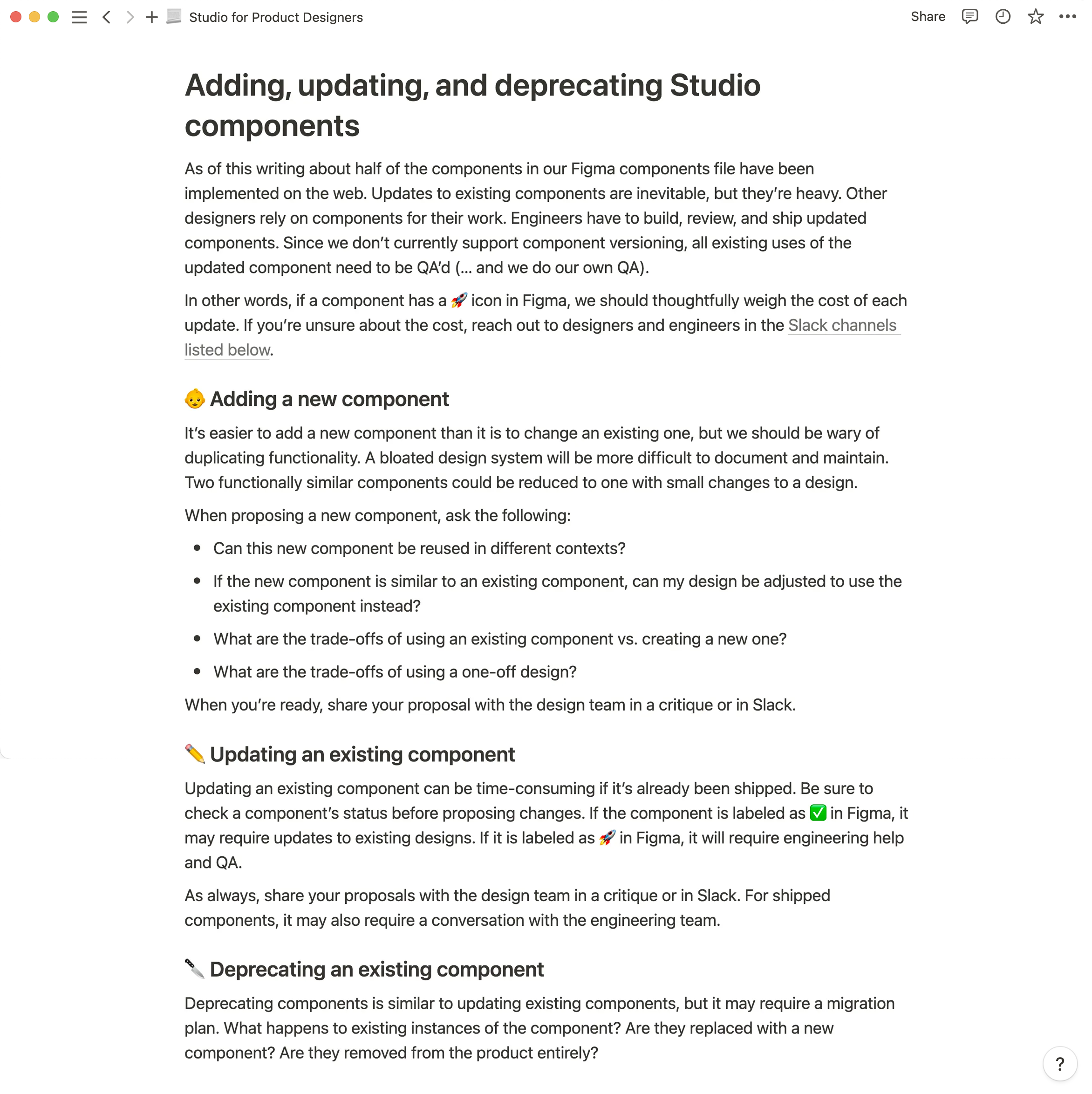
Notion documentation on adding, removing, and editing components
Our web-based documentation was mostly used by engineers for code snippets and implementation guidelines. My goal, however, was to make our website the canonical handbook for designing, building, and writing for Patreon. I hope to see the team make use of our early explorations for that work one day.
Web-based documentation
The interpersonal part
Maintaining a design system is as much about managing personalities as it is about designing tokens and components. Some designers embrace guidelines and consistency while others feel constrained by it. Giving designers spaces to share feedback and offer recommendations was important to ensure the team felt like Studio was ours – not mine.
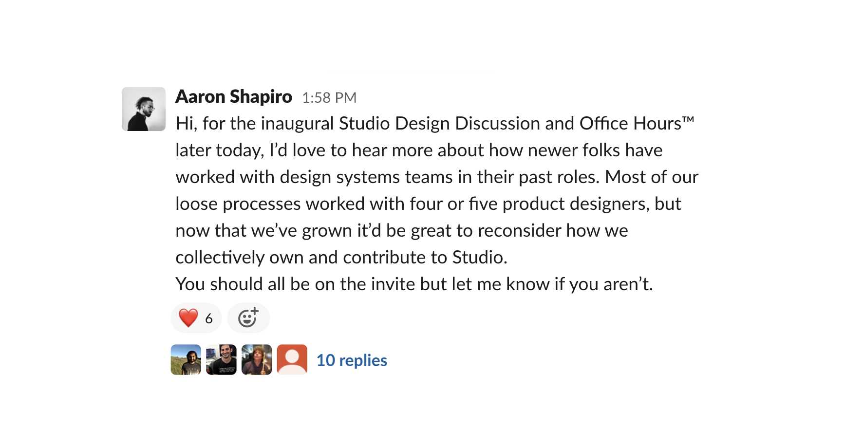
Announcing our inaugural Studio office hours in Slack
We also hosted a weekly, hour-long QA party (I use this term loosely) on Fridays, open to both designers and engineers. It was an opportunity to hop on Zoom, catch up on new additions to the design system, and ensure everything was working as intended in a casual environment that didn't necessitate tedious bug reports.
In use
Navigation overhaul
The product design team collectively worked on a complete overhaul of Patreon's navigation and information architecture – both on the web and in our apps. It launched alongside our design system, commemorated with a snazzy launch video created by Gabe, the project's lead.
The internal launch video for our design system and navigation overhaul
The team used this as an opportunity to improve or redesign some screens, like our feed.
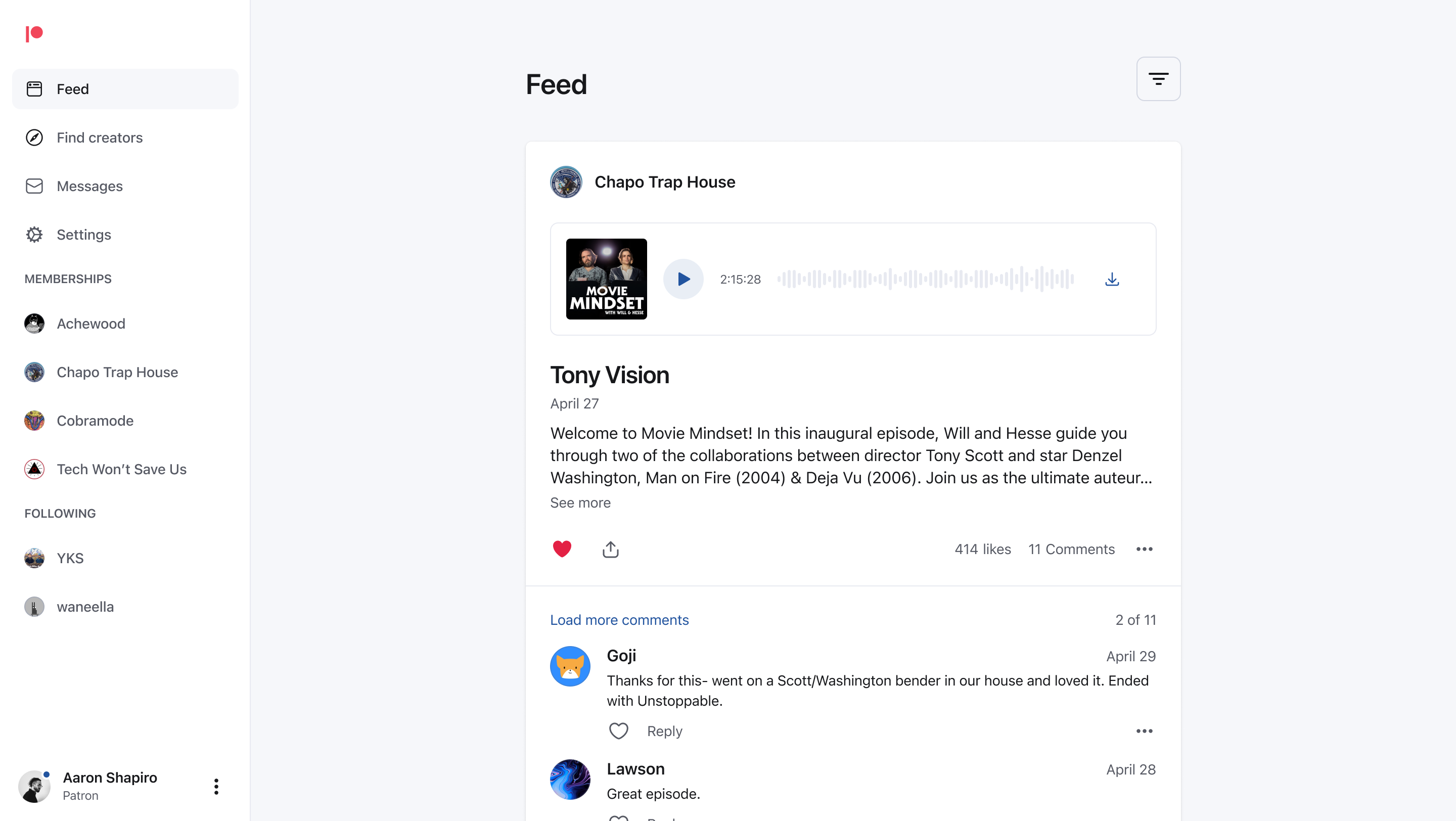
The patron feed on desktop
The redesign wasn't only responsive, but it was cross-platform as well.
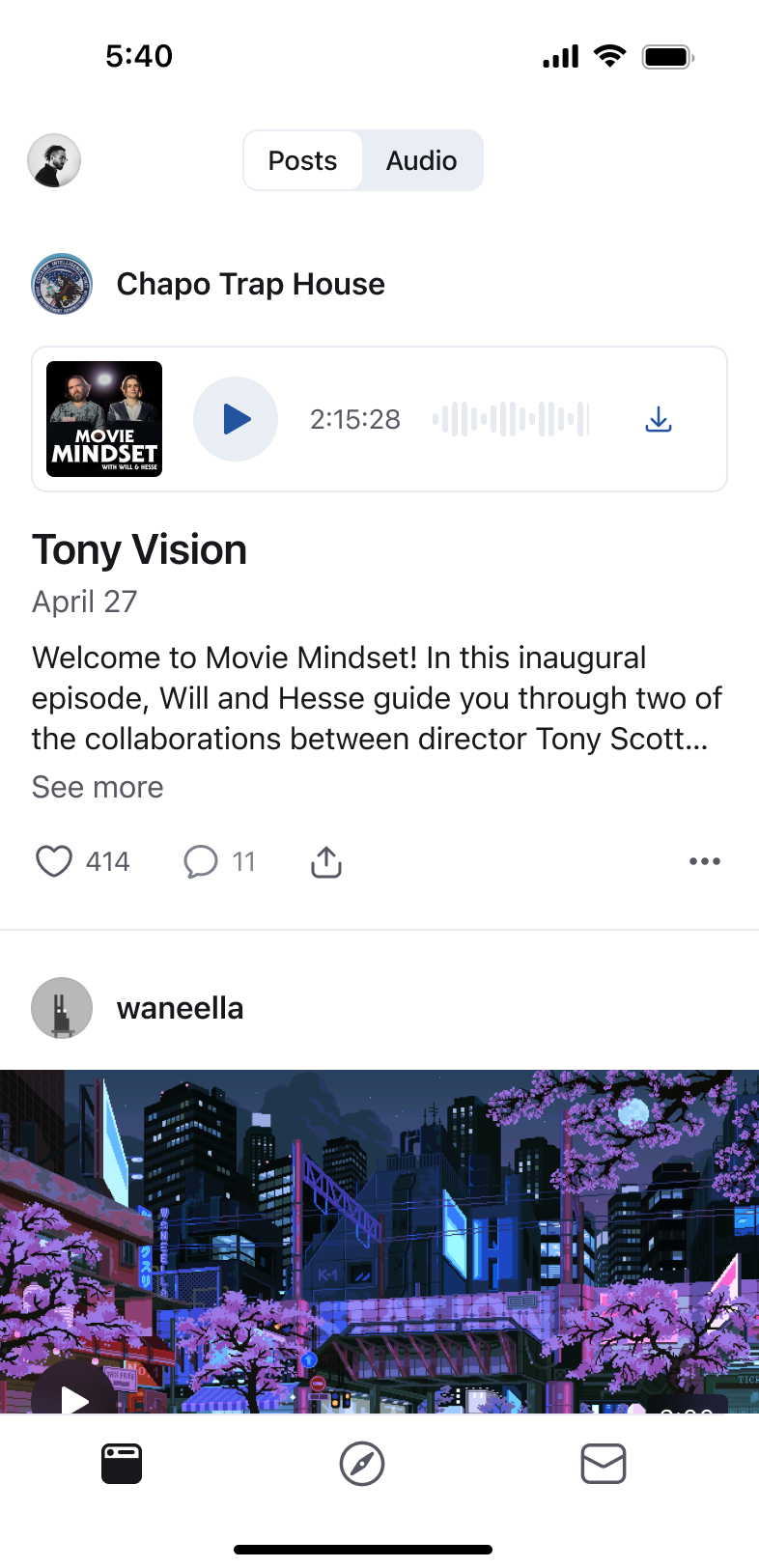
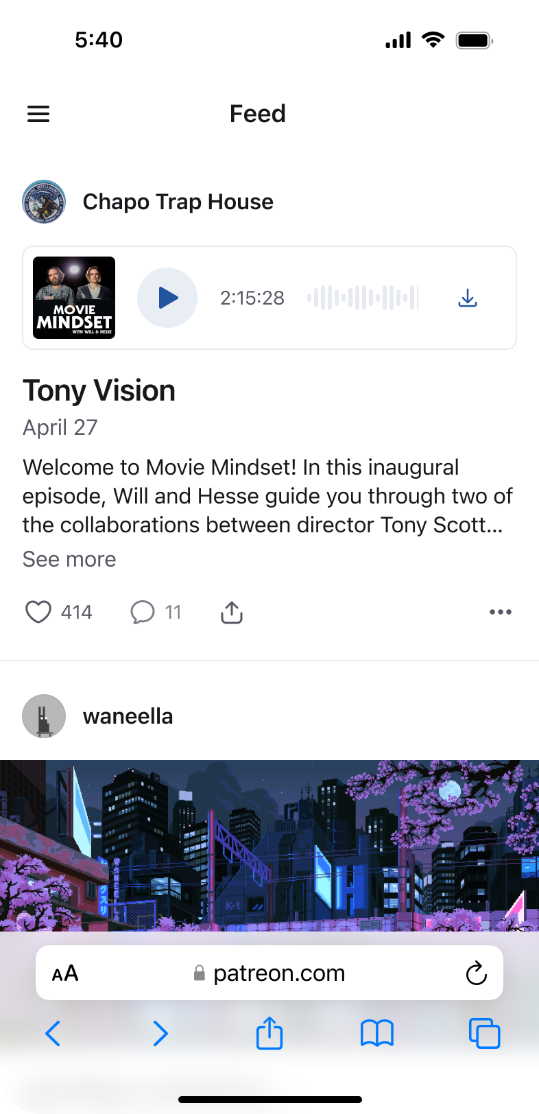
The feed on iOS and mobile web
We weren't able to redesign every screen, but we did rebuild every screen to clean up tech debt and make use of our new design tokens and components.
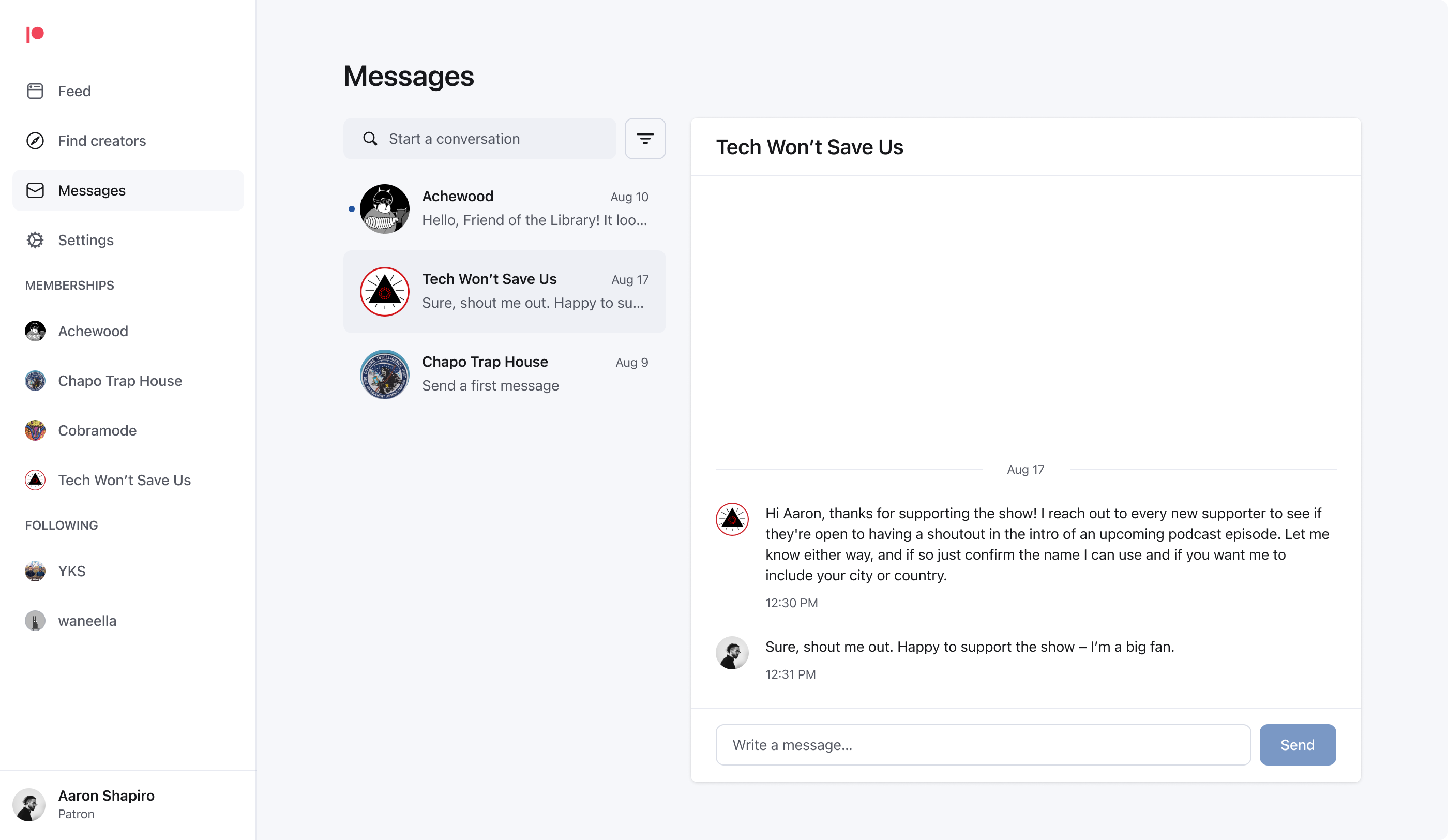
Messaging on desktop
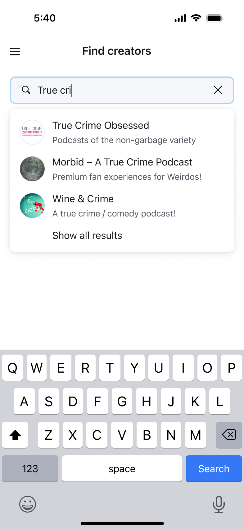
Search on mobile web
Patreon Video
Patreon had always leaned on YouTube or Vimeo for video hosting. I led design on our first natively hosted video product – allowing creators to upload videos directly to Patreon for the first time. This cut down on hosting costs for creators, reduced leaks and piracy, and was much easier to understand.
The announcement for Patreon Video, created by our marketing team
Our post editor was one of the screens rebuilt during Studio's launch. This made it easier to implement some of the video-only features that launched with this project.
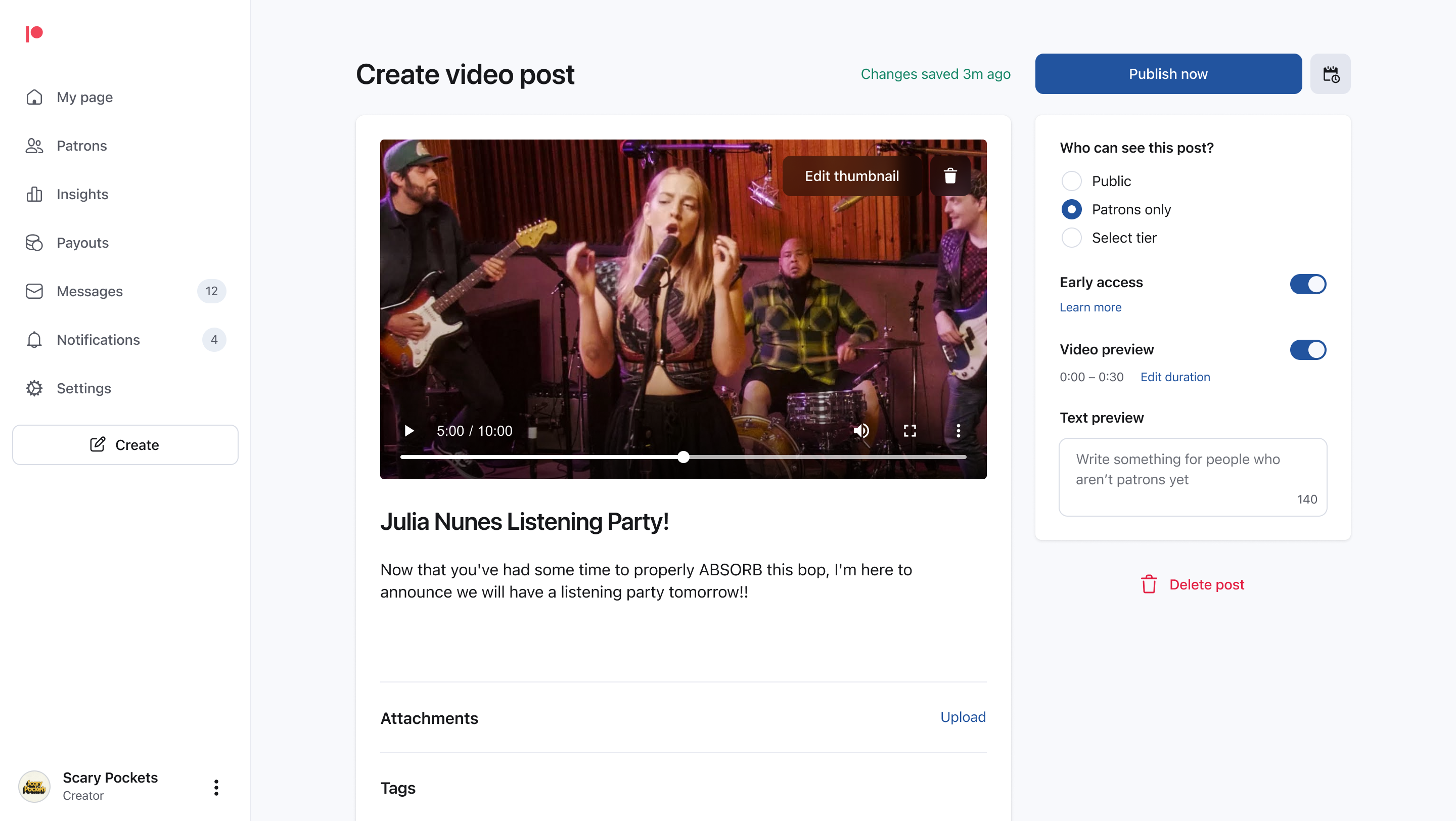
Uploading a video in the refreshed post editor
Along with hosting feature-length videos for patrons, we allowed creators to trim previews for people who haven't become patrons yet. Video previews led to a small but non-trivial bump in patron acquisition and would later be adopted for audio posts as well.
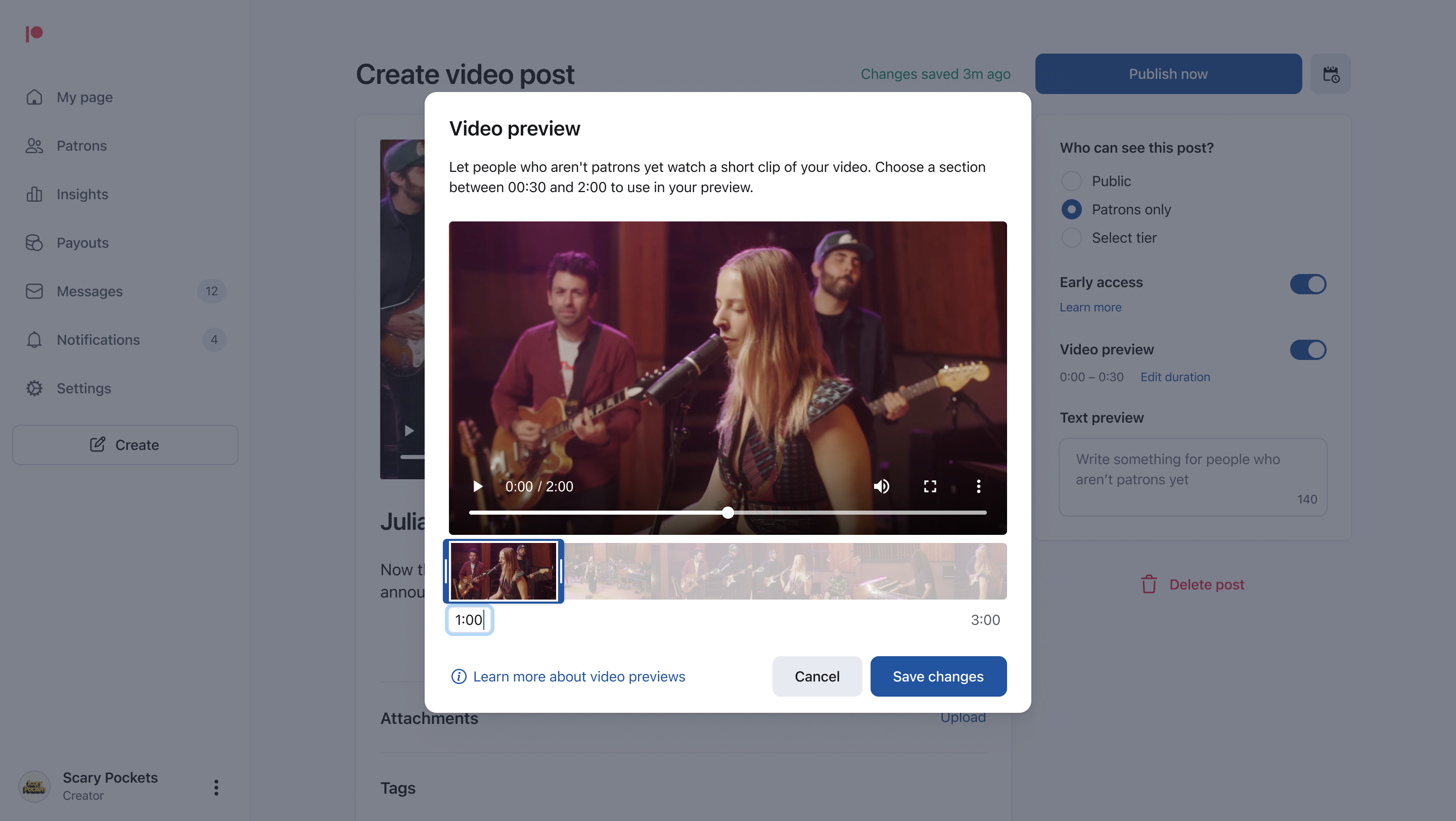
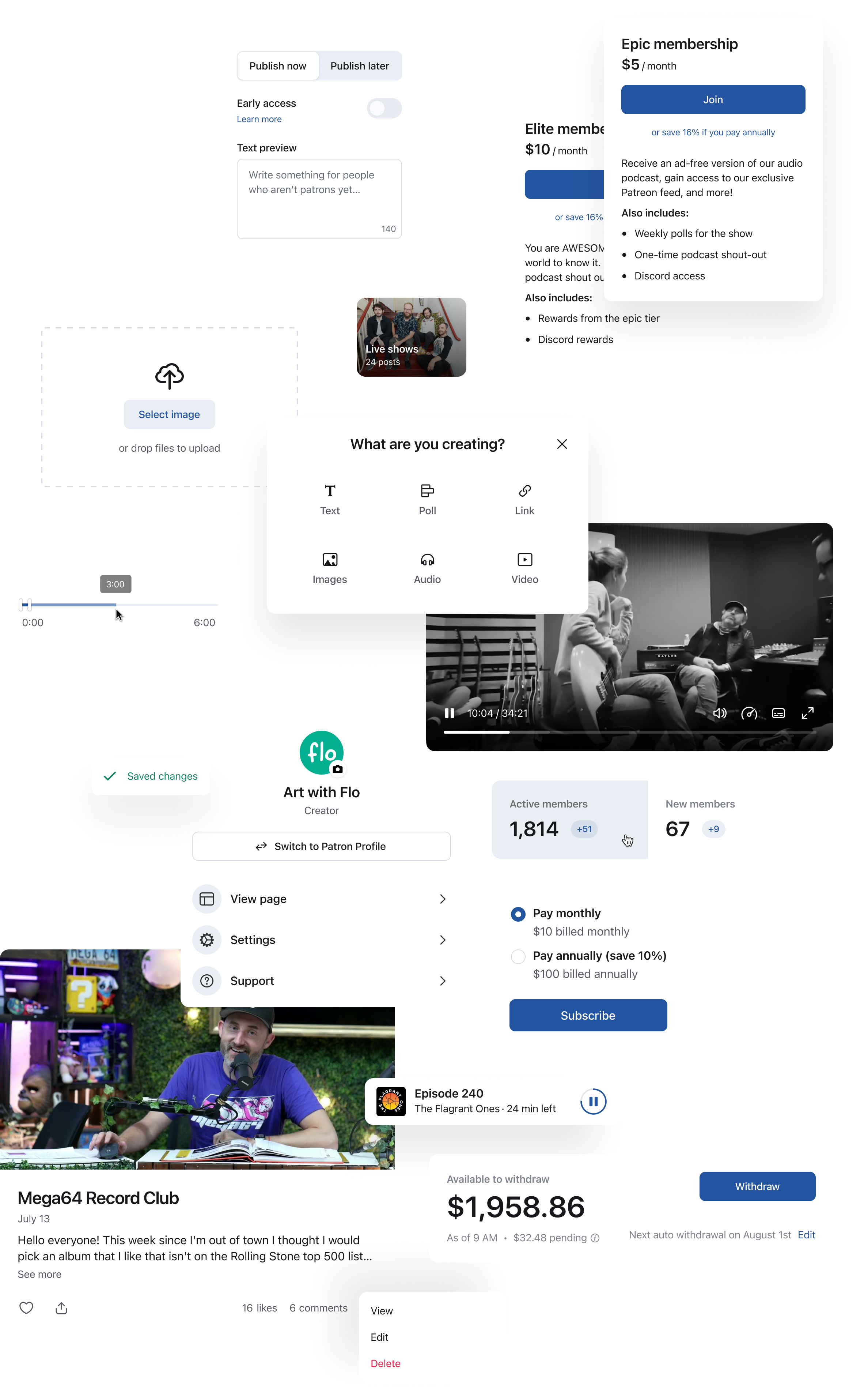
Trimming a video preview for non-patrons
One of the video-specific components created for this project was the slider – a form element that helped creators trim their videos.
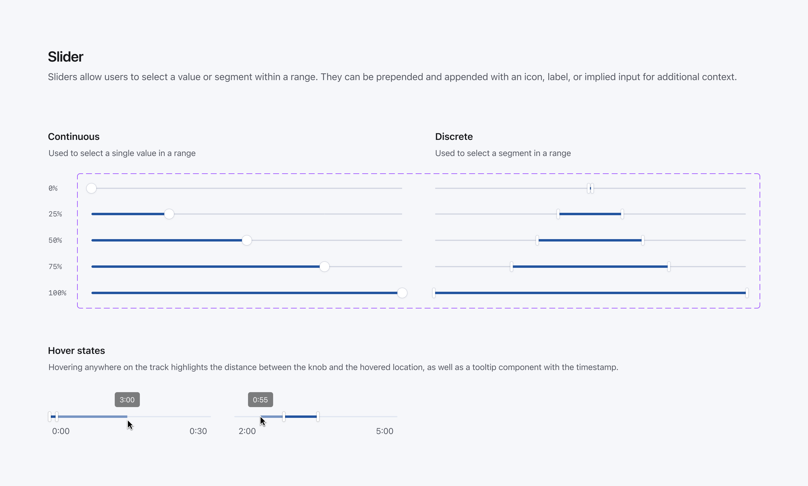
The slider component
Aislinn redesigned our checkout flow, making it easier to understand what you're buying, when you'll be billed, and how you'll pay. This work required new form elements and updates to our grid system.
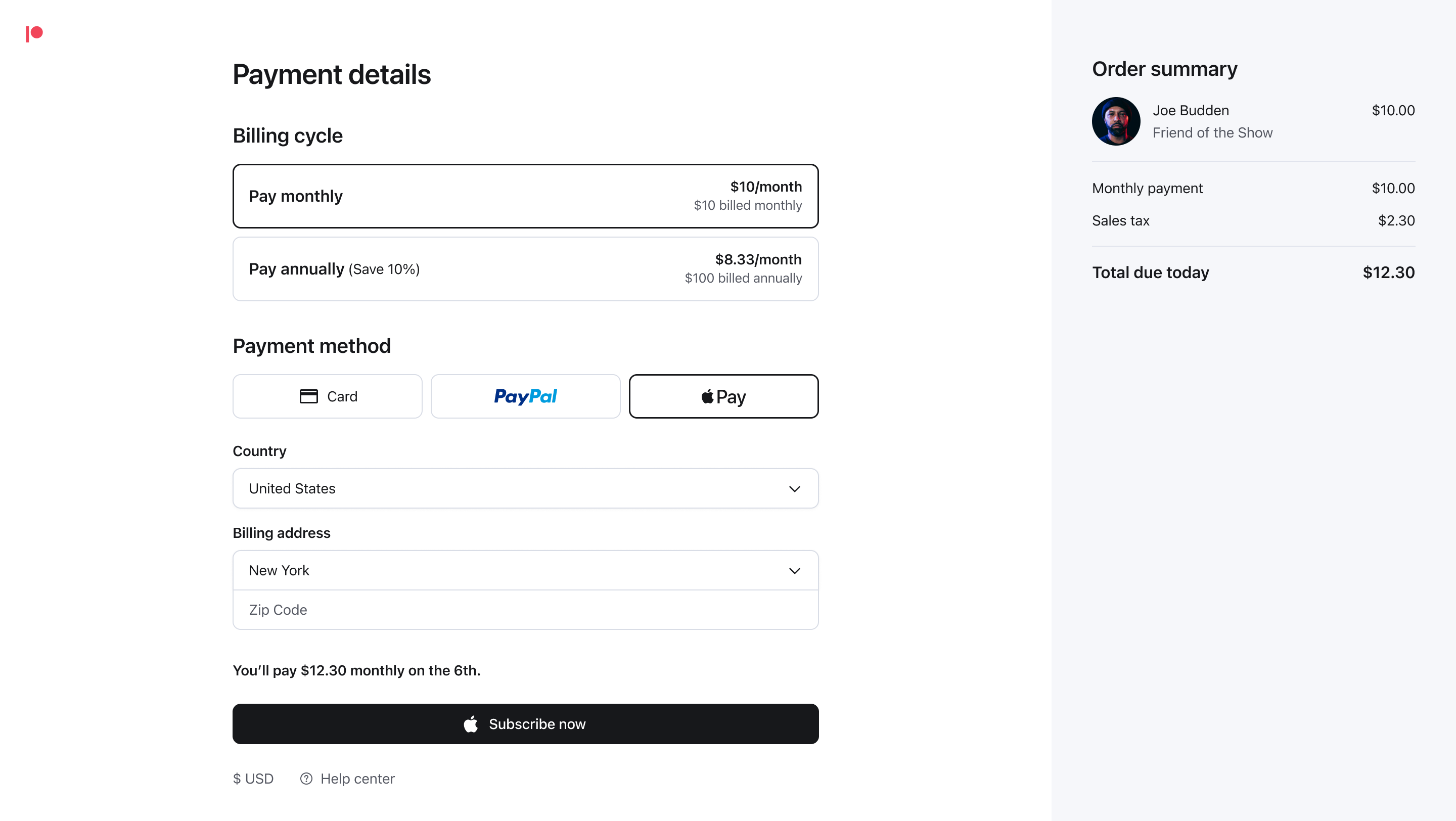
Becoming a patron
Our selector button was one component created for this project. It was a rich form element similar to a radio button that could contain text or images.
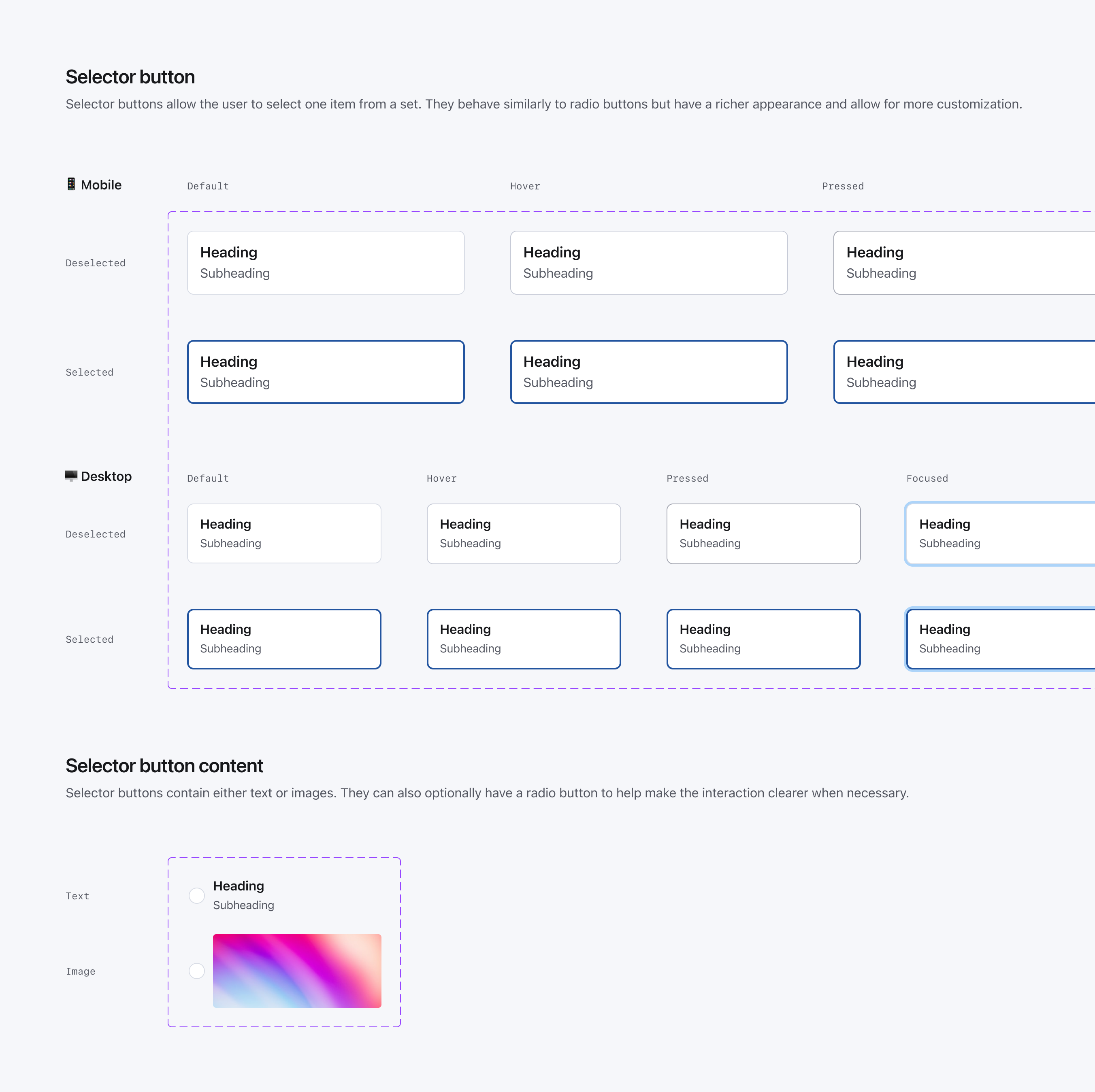
The selector button component
Grace designed Patreon's new creator insights hub. This was a product that helped creators understand how their content and memberships were performing.
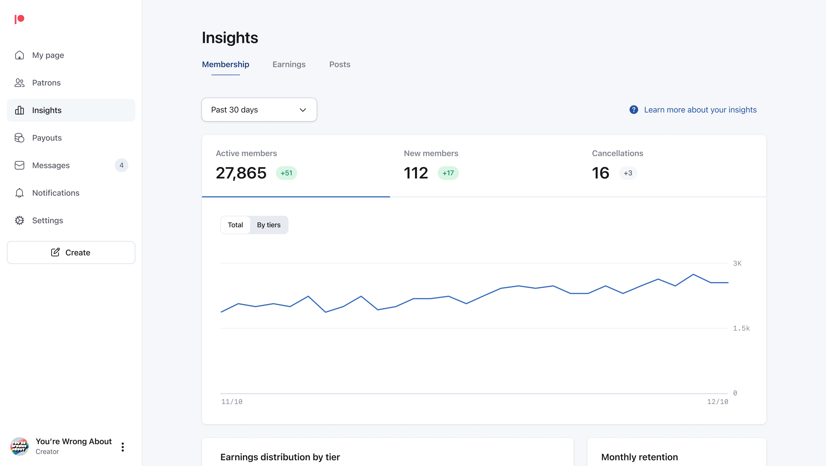
Creator insights
Creator insights launched alongside our new page header component – a complex component that functioned and appeared differently across our platforms.
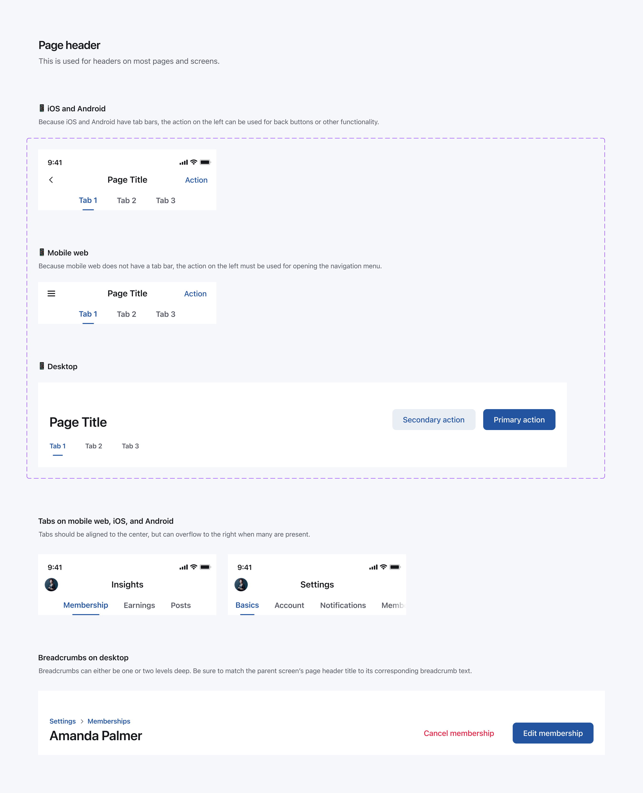
The page header component
Thanks
My time at Patreon was brief, but I'm proud of the work we did to build a design system the right way – through empathy, transparency, and a sense of collective ownership. It was my project, but our design system belonged to everyone.
There are too many people to call out individually, but I'd like to thank everyone who contributed to our design system – product designers, brand designers, content designers, engineers product managers, and others. I can't wait to see what they do with it next.